Z I N E


The past week I continued to work towards a few graphic design projects to include in my zine. In full, the zine is now 12 pages which I am planning to get printed and distributed very soon. This is my first time creating a full product and I am extremely grateful for the use of this blog to promote my work.


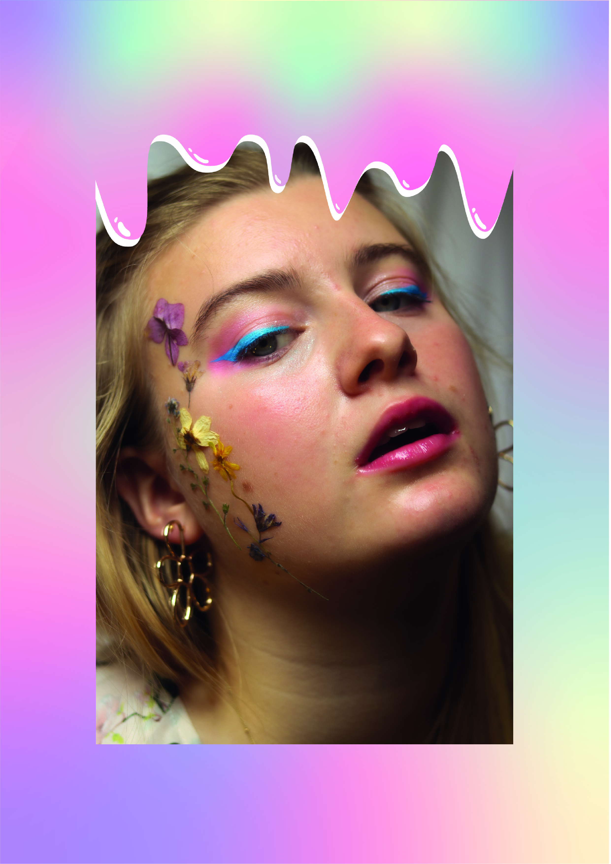
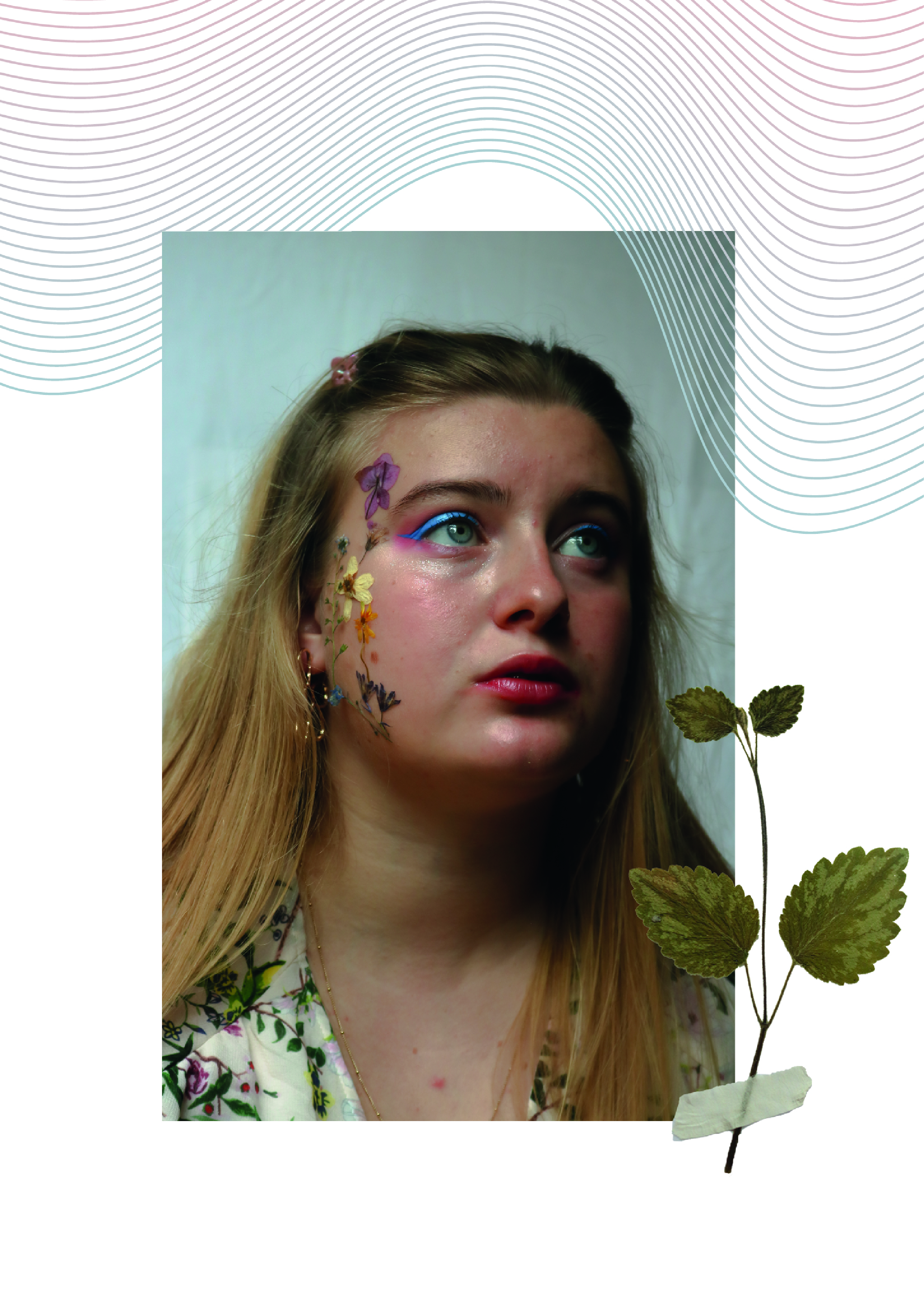
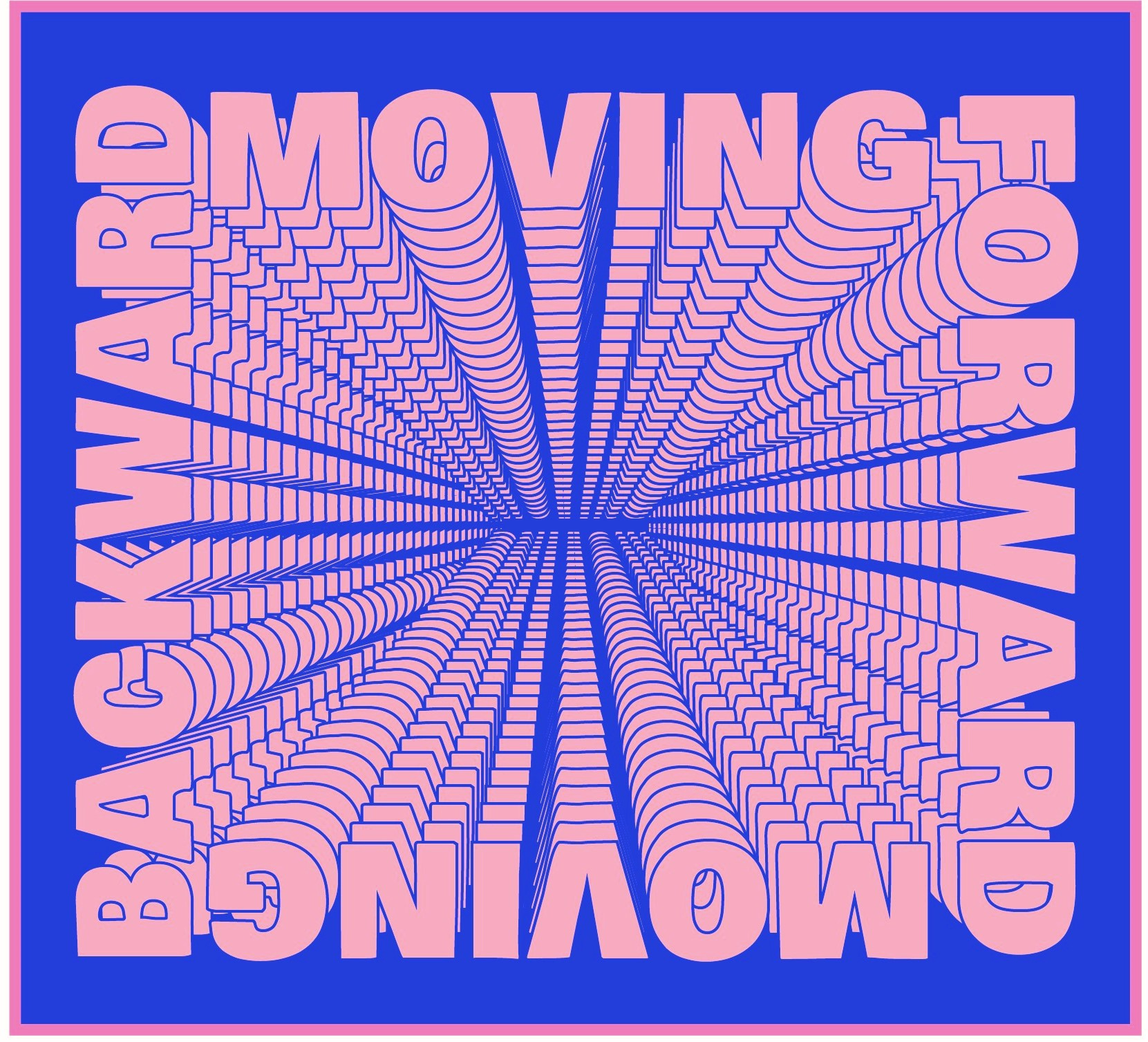
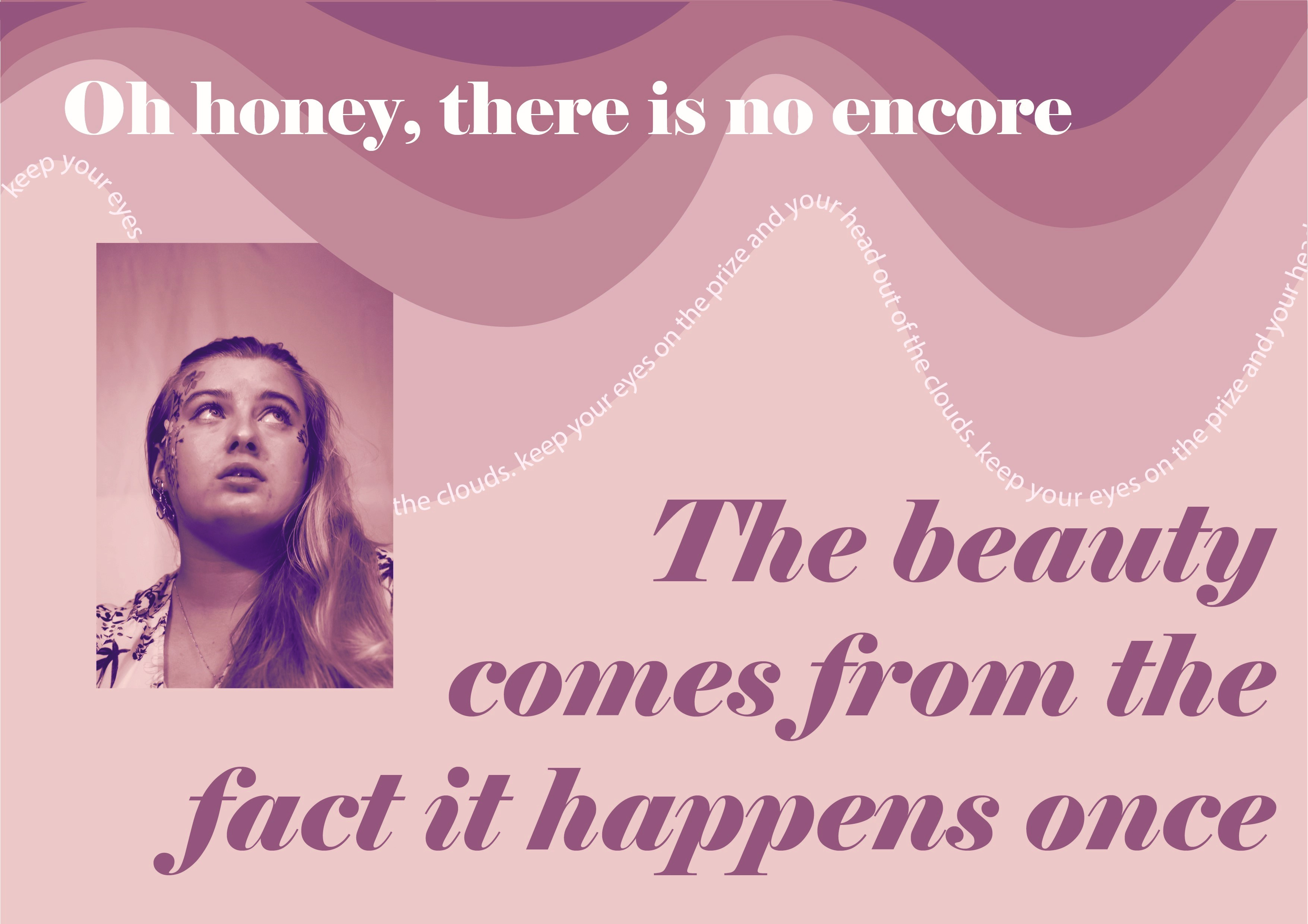
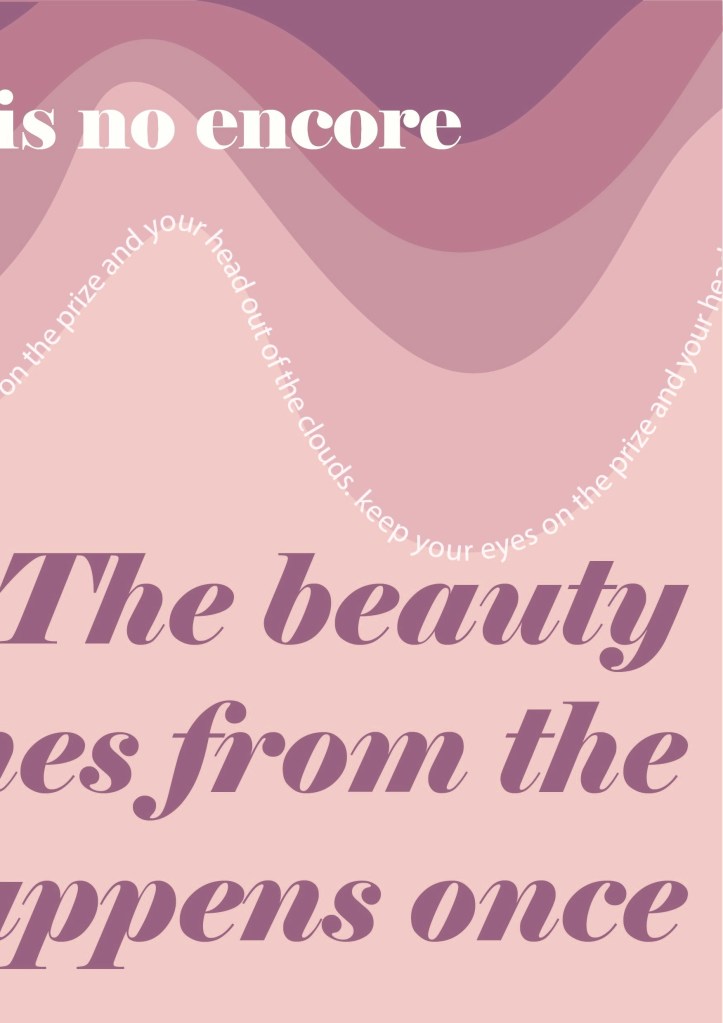
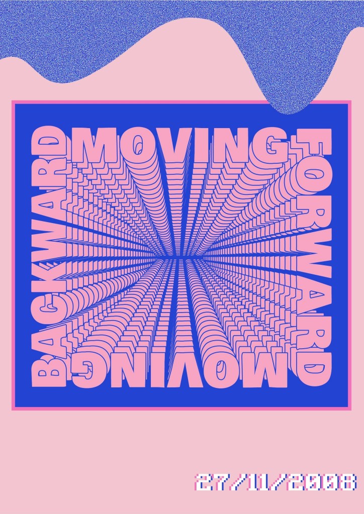
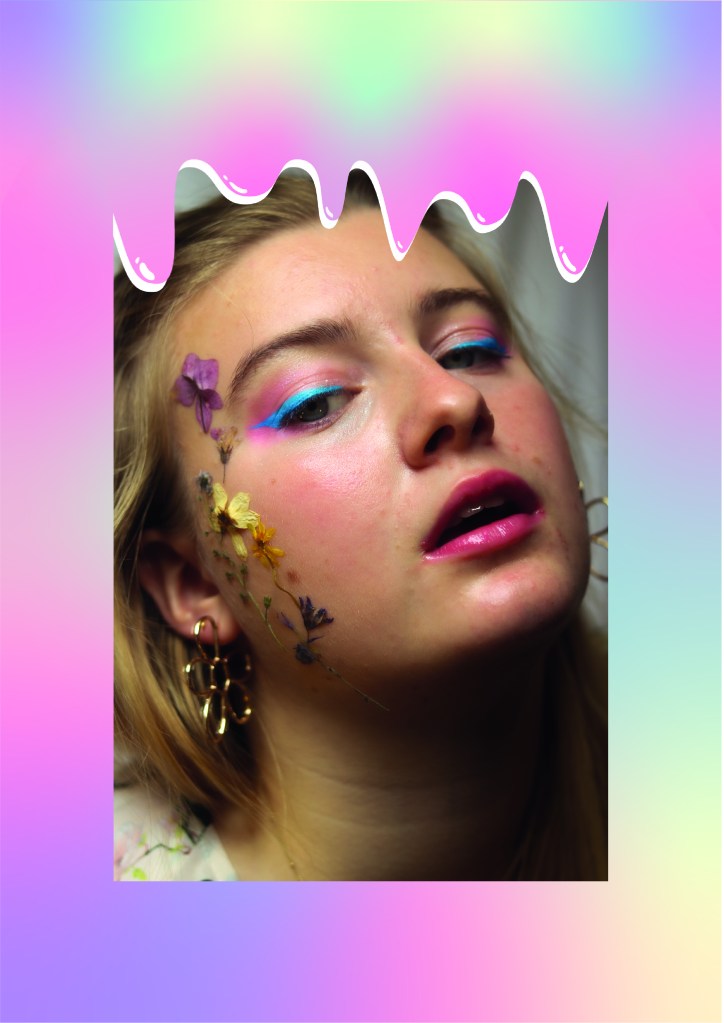
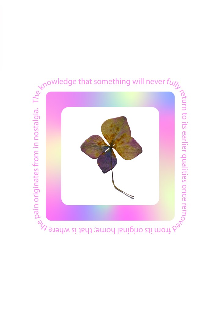
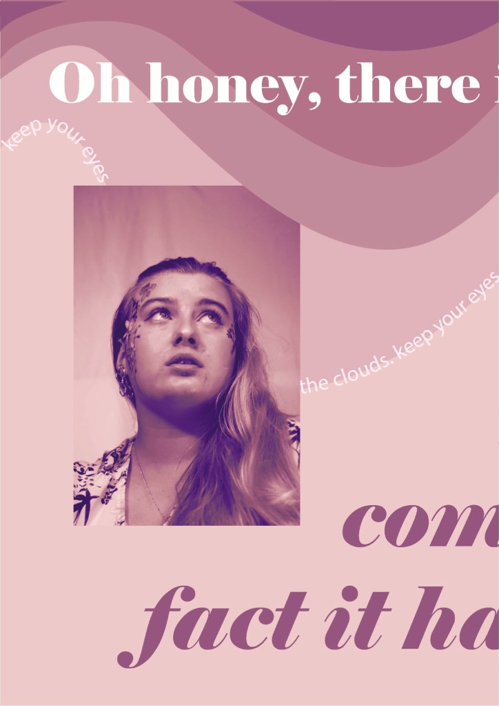
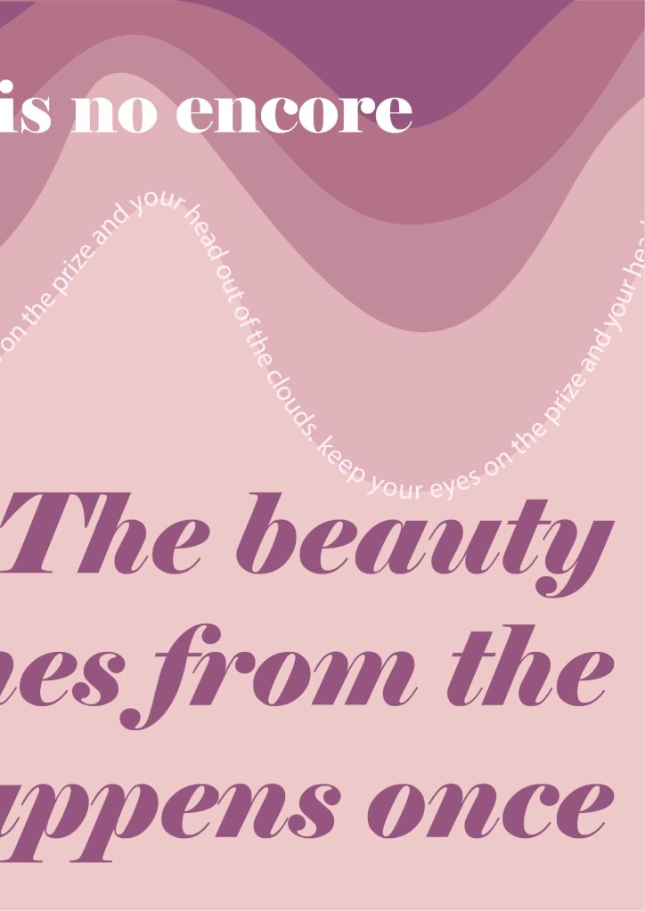
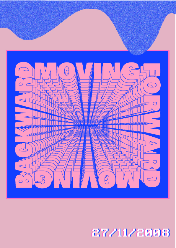
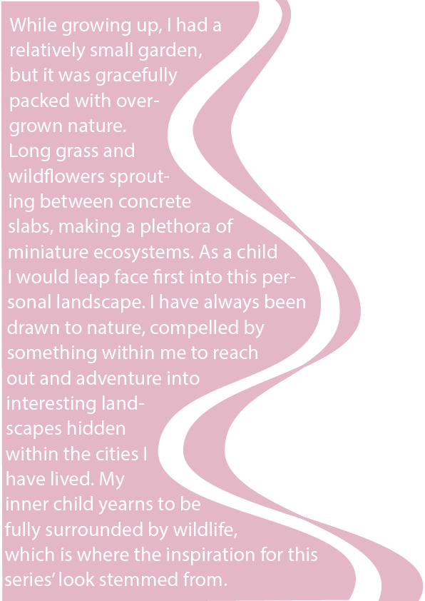
The zine lends itself to a scrapbook aesthetic, with the taped down pressed flowers and somewhat diary entries. I believe this adds to the childlike innocence I am trying to convey. I wanted to make an analogous theme throughout the zine, with each page incorporating organically smooth shapes and twisting lines. The idea was to create a fluid motion which brings the viewers’ eyes to all corners of the spread, and seamlessly transports them overleaf.


Have a flick through the E-zine here.

Z I N E


This week I began to develop a series of mock pages for a zine. I pulled influences from 2000s styled advertising and retro computer games because that was my first experience of graphic design growing up. My initial thoughts on colour palettes was pastel pinks and vibrant blues. I wanted to create an iridescent title and I experimented with a myriad of different coloured gradients until I found an effect I was pleased with.


The main concept and story behind the zine is how I have become addicted to romanticising the past. For me, it’s easy to paint my childhood in such a glowing brush that I find it difficult to appreciate current life in the same light. With each major life change, I am forever believing that those were the good old days, without giving value to the present. With these graphics and words in my zine, I am attempting to fall back in love with my current life, rather than only enjoying the moments when they become memories. Forever looking back is no way to live life.


Have a flick through the digital copy of first pages in the zine.

More to come soon.