the space to create
the opportunity to blog
the chance to experiment
the time to think and examine.
Until next time…

In this post I will be further examining my practise by looking at my fascination with post and postcards. In previous posts I have looked at other tools I use in my work such as Labels and Instagram.
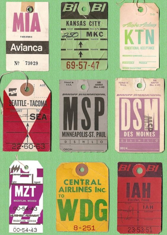
I have always loved getting post! I sign up for as many catalogues as I can to feed my obsession. I wrote to the Queen when I was 11 and was overwhelmed by the beautiful gold stationery that housed the response. Furthermore, every Christmas I receive a parcel that excites me more than any other. It is from a friend in Japan. It amazes me how different the stationary is, the parcel is packaged, and the postal service labels are. Recently, I have been sorting through my massive postcard collection and have found that 148 x 105 mm or 5.8 x 4.1 inches (the standard size of a postcard) is perfect for so many things. Below, I will show some examples of postcards from my collection and postal experiments I have been trying.
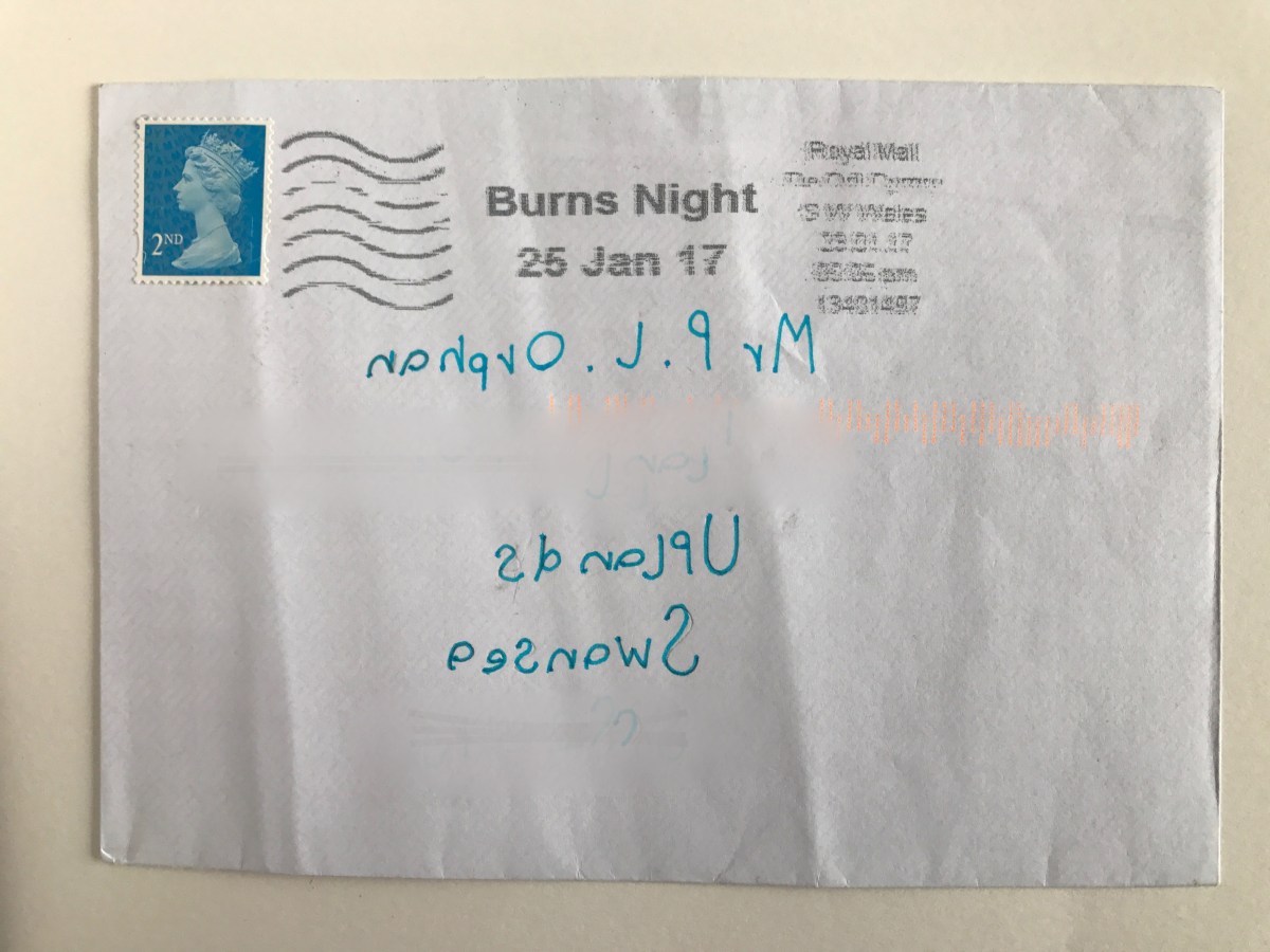
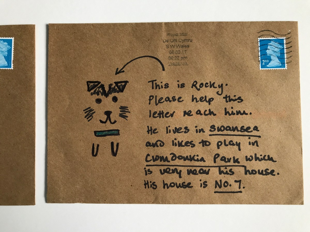
I was introduced to the book “The Englishman Who Posted Himself and Other Curious Objects” and the work of W. Reginald Bray during my foundation course. I read and began trying out some of his experiments for myself as a personal project.
“In 1898, Bray purchased a copy of the Post Office Guide, and began to study the regulations published quarterly by the British postal authorities. He discovered that the smallest item one could post was a bee, and the largest, an elephant. Intrigued, he decided to experiment with sending ordinary and strange objects through the post unwrapped, including a turnip, abowler hat, a bicycle pump, shirt cuffs, seaweed, a clothes brush, even a rabbit’s skull. He eventually posted his Irish terrier and himself (not together), earning him the name “The Human Letter.” He also mailed cards to challenging addressessome in the form of picture puzzles, others sent to ambiguous recipients at hard to reach destinationsall in the name of testing the deductive powers of the beleaguered postman.”
Examples of some of my successfully posted and yet unposted work can be found below.


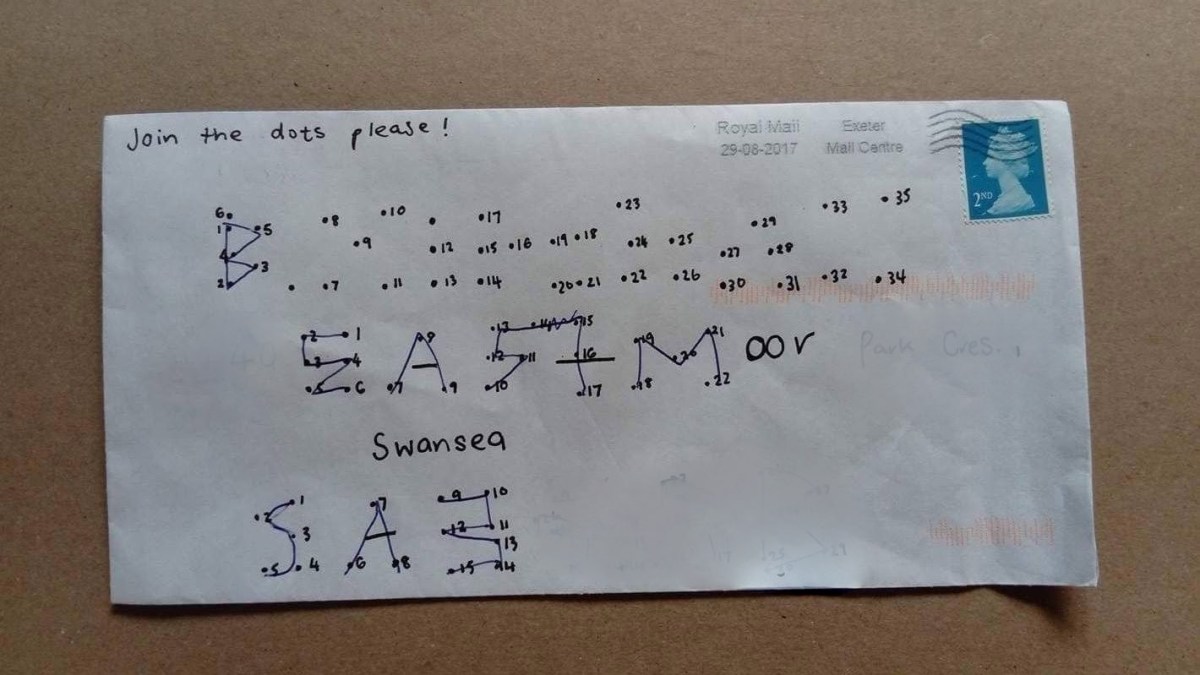
I think I will continue to enjoy taking inspiration from Bray’s work. A few weeks ago, I discovered an artist who has a similar passion for testing the postal service. Examples of Harriet Russell’s work can be found below along with a surprisingly successful piece I created in Russell’s style and sent to Beckie. I am already planning my next challenge.


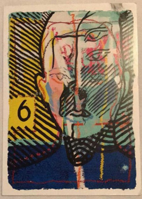
Postcards are the best form of affordable art! When I visit an exhibition that I especially love it is great to buy a postcard as a memento. I am slowly building up an ‘inspiration hoard’ to bring to university with me. This will mostly be made up of postcards from my favourite exhibitions. Below is an example of a book of postcards I bought at a recent Rembrandt exhibition and a postcard Beckie sent me when she went to the RA Summer Exhibition. I will send Beckie and other artist friends postcards I think will inspire them from exhibitions I see this year. It’s a fun way to keep in touch!


Over the years my family and I have been sent many postcards from friends and family who are on their holidays. Memorably from a 97 year old friend who recently made me very jealous with a postcard from the Northern Lights! We also continue to send holiday postcards ourselves. Some people wonder what the point is when we can easily send photos over the internet and often arrive home before the postcards. In one particularly memorable case my Aunty Gwyn received a postcard from a trip we went on to Rome a year after we posted it because of the notoriously slow Italian postal service. For reasons of nostalgia and the opportunity to have a handwritten note to show you are remembered by a loved one is reason enough to not let the holiday postcard die out. There are also some fun varieties to try out! When I was in Hungary this summer to test some fun variations I sent Beckie and my family a variety of different postcards:
the giant postcard (An A4 image that baffled the Hungarian postal workers and also doubled as a lovely souvenir as it can be easily displayed.)
the digital postcard ( A postcard created with the app Postsnap that allows you to use your own photos (as a photographer I love this!). It is then printed and sent. A lovely idea to make the postcard even more personal.)
the postcard coaster (Another souvenir/postcard. A beautiful illustrated coaster that can be addressed on the back.) Images below.


I love freebies! Some of my favourite postcards are those I have got for free. Examples are below.


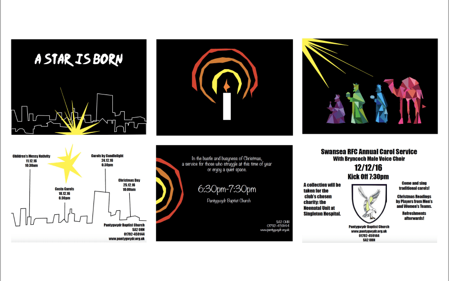
Probably inspired by the above, I created a range of postcards recently for some Christmas events my church was hosting. They are the perfect size for an eye-catching advert! The front and backs of three of these postcards are shown below.
And finally, I would like to take the chance to reflect on mine and Beckie’s postal adventure! I have had such a lot of fun creating and receiving postcards. It has challenged me to be creative in so many ways. Our project was inspired by the work of artists Giorgia Lupi and Stefanie Posavec but has become so much more than just a ‘dear data’ experiment. Beckie’s infographic postcards (which can be found on this blog) have taught me so much about her. I am going to use them as inspiration for my infographic work. I hope we can continue to send each other postcards and stay in touch as we start our degrees. Below are some of the postcards and letters I sent to Beckie.

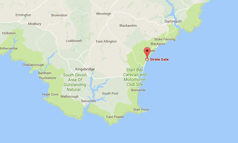
Recently, I spent the day at Strete Gate Beach with my family while on holiday in Devon. I decided to document this day in a variety of different ways. I was unable to get blank postcards so I decided to use envelopes as my starting point. I was challenged by a lack of materials and stimuli. Therefore, it was a fun challenge! Below are the outcomes and the challenges I set myself.
Challenges
I think my favourite outcome of these mini exercises was the pen journeys. They really reflect the uneven and unexpected pleasure of driving in the countryside. Furthermore, looking at them now they look almost like coastlines. And we were travelling to a beach! They are a loose form of map. I think I could continue to use this practice to record a range of journeys. It might also be interesting to layer a more formal representation of the journey over the top (eg. traced off google maps).


In a continuation from my post on labels, I will be examining another area of my practice…
Instagram is a social media platform where users share images and short videos with their followers. There are around 500 million active users. It is therefore a perfect place for businesses, artists and influencers to access a global (often millennial) audience. However, with an average of 95 million photos and videos being uploaded every day, the curation of content has never been more important.


Date Started: 18/07/15
Date Now: 08/08/17
Number of days used: 752
Post Regularity : post on average every 3.9 days
Followers: 271
Following: 1,207

Findings: I post on a wide variety of subjects and this does lead to a lack of professionalism and continuity on my feed. I post far more often when I am away from home. Therefore, I need to go to more effort to create beautiful images while at home. I feel that my art/design work is lost amongst other images, of my dog for example. I don’t want to lose the fun in posting so I think a separate more design focussed account is what I need. I will keep my personal account active too.
I would love to experiment with taking some flat lays. I first started thinking about this at the Natural History Museum in Oxford (I discuss this trip more in this post). I was taking images of exhibits in cases from above and finding the combination of objects and drawings very aesthetically pleasing. Furthermore, the camera angle seemed an effective one for taking a clean, shadow free image. Flat lays are images that are taken from above and are often of beautifully curated objects. They are popular on Instagram among fashion and lifestyle bloggers. Experimenting with this would fuse two of my interests: photography and objects. It would be a great way to photograph the tools I use in my work and my favourite things. Below are some inspirational images.


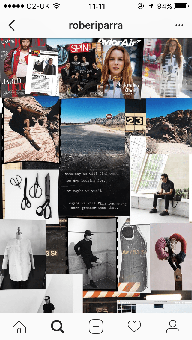
I have always enjoyed collage as an art form and being asked to create a mood board at the start of a project is a dream! I have been looking for some more unusual Instagram layouts and came across the fashion designer Roberi Parra. His feed when looked at as a whole resembles a mood board. It is a well curated collage of images and text. This sort of layout appeals to me in several ways Firstly, because it would ensure that there was a lot of thought put into each post. Despite the mood board effect only being visible when you view his entire page, each post is still beautiful. Secondly, as we begin to digitalise everything, creating a tactile and physical mood board before uploading it to Instagram would ensure I still have a physical connection to my work.


Inspired especially by printmaker Aftyn Shah I thought it would be good to try and include more of my work in progress. This is not something I have considered doing before but it would give my followers more of an insight into my practice. Furthermore, it would mean I could use my feed to look at how work has progressed. Shah is also very good at including objects (such as plants and tools) around her work in images that don’t detract but complemeant. I would like to also take inspiration from this.


One of the best ways to catch a person’s eye and to inject some joy into the world in my opinion is through colour! I am hoping to develop a bold colour scheme for my new design feed perhaps using some turquoise and pink (one of my favourite colour combinations). Art Director Andoni Beristain has an Instagram feed that makes me happy to look at. It is cohesive and professional but also joyful! It is important to inject a bit of personality into any platform that is showing your work.

That’s all for now. I will post again once I have started to implement some of the above ideas.

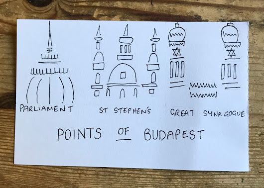
It has been a busy few weeks! I have just returned from Budapest and am starting to gather the photos/ephemera/drawings I collected and have made on this trip. I thought I would share some of the most interesting pieces with you here.
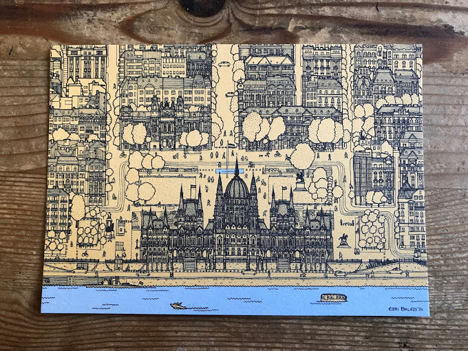
Budapest has a wealth of beautiful architecture. I took so many pictures of it all! I also did the below blind drawing. I am planning to do some more from the photos I took as I am pleased with how this one came out. Blind drawing has allowed me to enjoy drawing again. It is a loose and fun way of recording what you see. It often leads to an interesting abstraction of your subject. I highly recommend it. I was also able to pick up a couple of postcards to add to my inspiration hoard (which I am creating to take to university with me). The one below is by the illustrator Agnes Bogar.


I was very pleased with the souvenirs I was able to pick up on this trip. I was looking for something more authentic and truly Hungarian. I found in a bookshop and in a market several old Hungarian passports. Aesthetically they appeal to me in several ways. Firstly, they are full of old stamps, labels and handwritten sections! The vintage photos make them so personal. Finally, this could be the beginning of a new collection for me. I am going to have fun translating them and using them as inspiration for my work.


Mapping was something I planned to do a lot of on holiday. In reality, I had little time for this with all of the touristing we did. I did however, pick up postcards by several Hungarian artists who explore mapping in their work, below is one of my favourites. It is by the artist who goes by the name Urban Sidewalker. It was a struggle to choose which of the beautiful postcards to bring home. I hope the postcards I collected will continue to inspire my work in the future and remind me of my wonderful trip.
Once I got home I was able to design my own postcard in response to the artwork and architecture I saw. I hope to produce more soon. I find the postcard the perfect size and shape for everything! It has become a motif in my work. There will be a blog post in the future all about postcards.

On the 15th July there will be an Open Studios event at Elysium Studios to coincide with the Troublemakers High St Festival that weekend.
Tegan, Beckie and I have been invited to join Ben (winner of the studio residency) to produce work for his space. We will be displaying our own work as well as certain collaborative projects we have devised.
We have set ourselves the following collaborative tasks:
Inspired by a mini project we were given when we travelled to Amsterdam with our foundation course, we will all be taking a photo on disposable/film cameras every day at 3pm. We will then write/draw/document something on a post it note to accompany each image. This will be a fun way to see what we are all up to from now until the exhibition.
We will be using the final few shots on our cameras to take 4 images that represent the following 4 concepts:
Line
Mundane
Label
Loss
We will also be undertaking a challenge on one day to write a list of everything we touch. This will become a study of the objects we come into contact with. The 4 most interesting things will be photographed on our cameras.
Below is an image of the space where we will be exhibiting. We hope you can all join us ! 

Tomorrow I start my journey to Budapest, Hungary. I am hoping to document this trip for my residency in a variety of ways.
Firstly, I am going to take inspiration from the a book I recently purchased called “From Here to There: A Curious Collection from the Hand Drawn Map Association”. This book is, as the title suggests, a collection of hand drawn maps. I have included some of my favourites below. I hope to produce some hand drawn maps that show various places I visit while on my travels.


Secondly , I plan to continue to take inspiration from the work of Giorgia Lupi and Stefanie Posavec and their Dear Data project. Beckie outlined the project in a previous post. I will use inforgraphics to record what I see and experience while I am away. I will take inspiration from some of the categories that Lupi and Posavec used such as clocks, laughter and indecision.

Also, I am hoping to work on drawing techniques that I have been introduced to this year on my foundation. These include continuous line and blind drawing. Below are some images I have found for inspiration of architectural continuous line drawings.


As well as these individual challenges I will be working on several collaborative projects with my fellow recipients of the Jane Phillips Award Ben, Beckie and Tegan. More to follow on this !

Before I begin to work on anything new, I want to examine my practice. The tools I regularly use give an insight into this. Today I am looking at….

I like to begin with looking at the definitions of words at the beginning of a project.
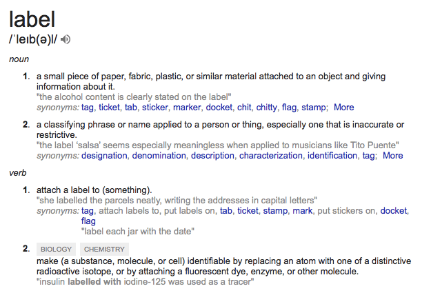 When looking at the word “label” I found the synonyms most interesting:
All of these objects are ephemera. They are only meant to be used for/are only useful for short amount of time. Stamps/tickets/labels etc. can be both very mundane in design and can be beautifully crafted. Perhaps the latter is in order for print based objects to compete with the digital sphere. This is where my interest lies.
I collect ephemera. Tickets from journeys I have been on and experience I have had, stamps from all over the world, leaflets and catalogues with a design aesthetic I like and postcards etc. Often the ephemera I keep has a sentimental value. This has made me wonder …Does the fact we can touch it mean it has a greater affect on us ? Taking boarding cards for planes as an example. I would definitely keep the official traditional card tickets and probably keep the flimsy paper version you print at home. But would I save and store the digital variety that are becoming ever more popular? What will the effect be on our society as we begin to digitalise everything? Will we lead less cluttered and more environmentally friendly lives ? Or will we create an unsentimental generation who are only capable of communicating in the digital sphere? (Funny writing that on a blog) Something to think about…
Anyway, back to my love affair with the label…
The label is so important that I included my label maker (a very exciting recent purchase) on a list of 40 things that inspire me most. My ephemeral exhibition project looked at collecting and organisation. From the beginning of the project I was looking at how people arrange their collections and in order to make links between the 40/40 (objects that inspire my work) I designed a label asking certain questions of the pieces. Once all the objects had been labelled I was able to create infographics to determine certain questions I had about my collection.


The labels I added brought my sketchbook work from the 2D into the 3D and introduced an element of interactivity. The idea of synthesising the dimmensions became an important element in the final outcome. As this year has progressed, I have realised despite having graphic elements to my work I do not want to reject the 3D for traditional 2D graphic design. The label has become a symbol of where my practice currently lies.
On a recent trip to the Oxford Museum of Natural History and the Pitt Rivers Museum the curation drew my attention more than the pieces themselves. The various handwritten labels used to document pieces enhanced the work. They connected the viewer with the curators and the collector. The labels dated from 1880 to 1980 and were each unique and seem to be purpose made for the pieces. I bought a postcard showing the variety of labels and documented several of them in my sketchbook.


After this, I began to think about how artists and galleries label works in an unobtrusive manner. Perhaps it is time we ventured from the the black and white printed cards. I found the way that this was done at the UWTSD Artist in Residence Exhibition especially interesting. 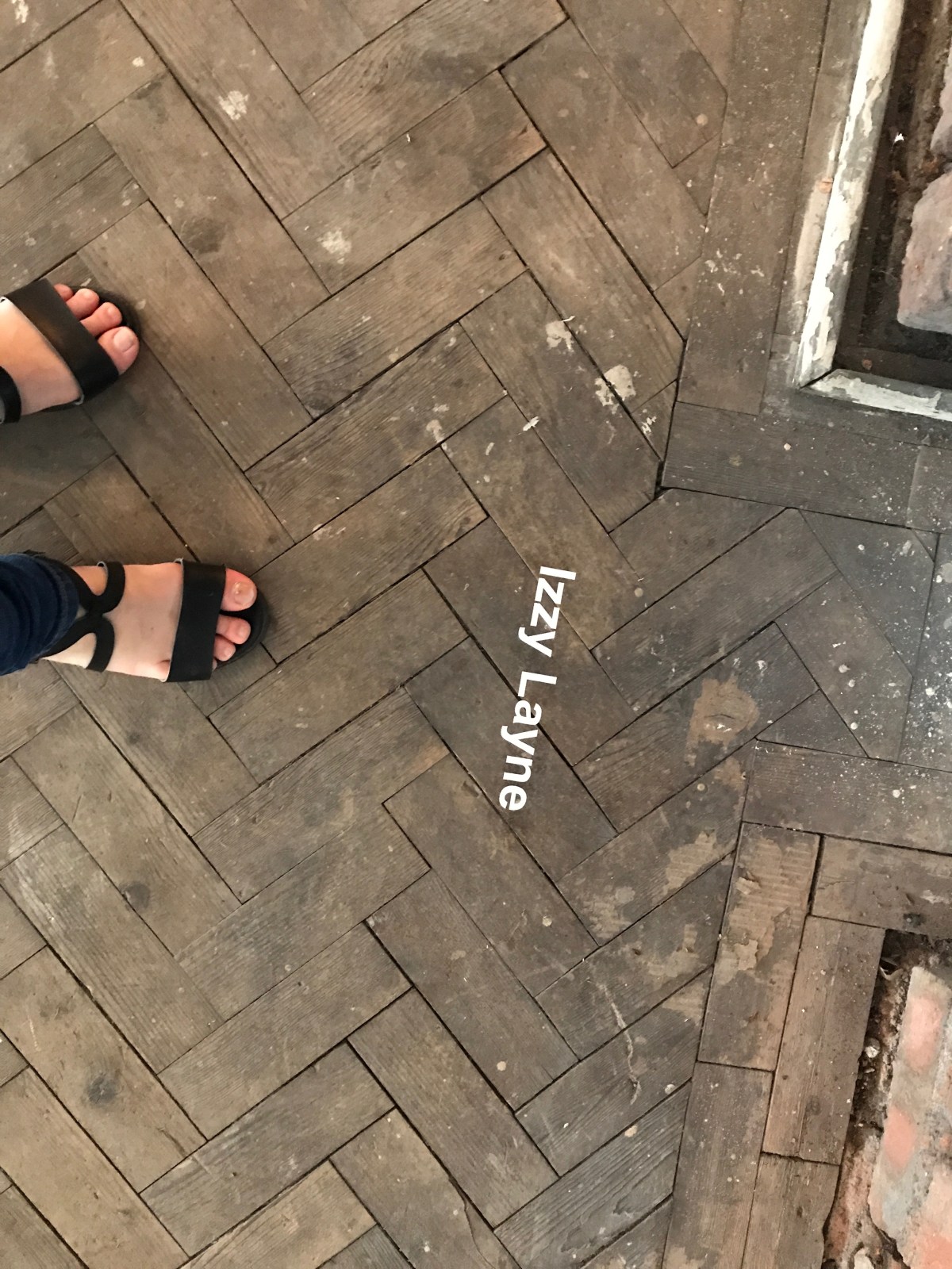
The label, the old fashioned hashtag, connects objects/images/art work and relays vital information. A label is a design challenge. It must deliver information clearly but also be aesthetically pleasing and not detract from what it is labelling.
Some ideas for the future…

Hello!
I am Rachel, one of the recipients of the Jane Phillips Digital Residency. This summer I will be working on a number of art and design projects and sharing them here. As well as working individually, I will be working in collaboration with Beckie Mitchell. To begin I am sharing my application with you. This outlines some of the projects I intent to work on. I sent my application in the form of a giant postcard. The above image was on the front. This is a photocopy of some of the tools Beckie and I like to use in our work. On the reverse was the written explanation. This can be read below:
Beckie and I were both intending to apply for this award. In order to utilise the space to its full potential, we are proposing that we work both individually and collaboratively.
I am a designer and maker who works in a range of mediums such as textiles and photography. I have a graphic approach to my work but do not want to be defined as just a graphic designer. Much of my work is about combining images, text and various materials for interesting effect.
I would like to use this opportunity for the following:
My work is often in response to the social and political landscape. I would love to use this opportunity to contact local charities and organisations to see if I can perhaps create an infographic or a piece of social design.
I would love to develop my own personal practise as an art and design professional. I would like to refine my personal blog and develop an instagram account to present my work digitally.
Next year, I will begin studying a BA in Design at Goldsmiths, University of London. I want to make a good start on the reading list and work with new materials such as wood and metal. Also, practice skills such as book binding.
Moreover, as my collection of art materials and odd bits and bobs has been depleted over this year, I would like to start an inspiration hoard that I can take to university with me. I will be collecting magazines, leaflets, textiles, photographs, buttons, packaging and various other ephemera.
I have always loved post. I recently started recreating some of the challenges found in the book “The Englishman who Posted himself and Other Curious Objects”. This is an ongoing project and I would love to create more postal work and display it all.
For a while I have wanted to start a fashion infographic magazine. This opportunity would give me the time and space to launch and complete this project.
Beckie and I are both moving away from Swansea to study our degrees. We would love a community based outcome to be our legacy. Our individual practises have both similarities and differences. We found while working on a International Women’s Day project that we work well together and have a passion for our community.
Inspired by the designers Giorgia Lupi and Stefanie Posavec who constructed a way of conversing visually in the “Dear Data” project (http://www.dear-data.com), we intend to devise a similar method to share and communicate our ideas. This will include sending and leaving postcards, drawings, objects and any other relevant paraphernalia in the space.
We would love to meet artists and use the expertise of other creatives to help us as we start our creative journey and our projects.
