Post and Postcards

In this post I will be further examining my practise by looking at my fascination with post and postcards. In previous posts I have looked at other tools I use in my work such as Labels and Instagram 

I have always loved getting post! I sign up for as many catalogues as I can to feed my obsession. I wrote to the Queen when I was 11 and was overwhelmed by the beautiful gold stationery that housed the response. Furthermore, every Christmas I receive a parcel that excites me more than any other. It is from a friend in Japan. It amazes me how different the stationary is, the parcel is packaged, and the postal service labels are. Recently, I have been sorting through my massive postcard collection and have found that 148 x 105 mm or 5.8 x 4.1 inches (the standard size of a postcard) is perfect for so many things. Below, I will show some examples of postcards from my collection and postal experiments I have been trying.

NO.1

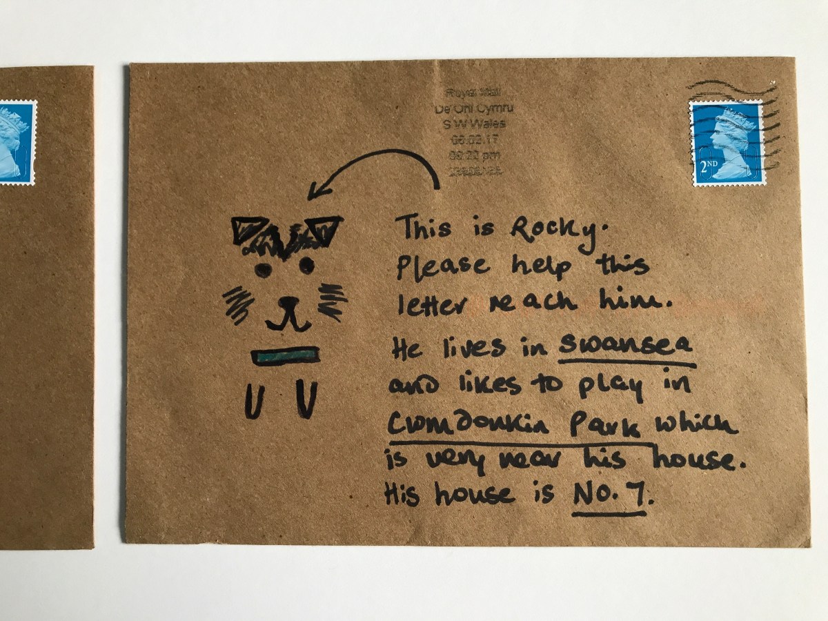
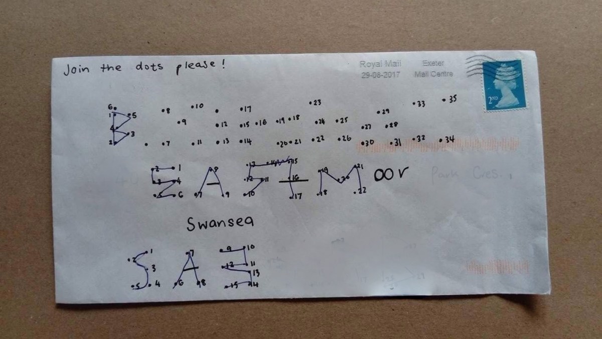
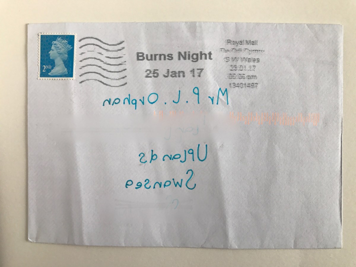
I was introduced to the book “The Englishman Who Posted Himself and Other Curious Objects” and the work of W. Reginald Bray during my foundation course. I read and began trying out some of his experiments for myself as a personal project.

W. Reginald Bray

“In 1898, Bray purchased a copy of the Post Office Guide, and began to study the regulations published quarterly by the British postal authorities. He discovered that the smallest item one could post was a bee, and the largest, an elephant. Intrigued, he decided to experiment with sending ordinary and strange objects through the post unwrapped, including a turnip, abowler hat, a bicycle pump, shirt cuffs, seaweed, a clothes brush, even a rabbit’s skull. He eventually posted his Irish terrier and himself (not together), earning him the name “The Human Letter.” He also mailed cards to challenging addressessome in the form of picture puzzles, others sent to ambiguous recipients at hard to reach destinationsall in the name of testing the deductive powers of the beleaguered postman.”

Examples of some of my successfully posted and yet unposted work can be found below.
IMG_0359IMG_6612IMG_1083IMG_5903

I think I will continue to enjoy taking inspiration from Bray’s work. A few weeks ago, I discovered an artist who has a similar passion for testing the postal service. Examples of Harriet Russell’s work can be found below along with a surprisingly  successful piece I created in Russell’s style and sent to Beckie. I am already planning my next challenge.


IMG_3096

NO.2 

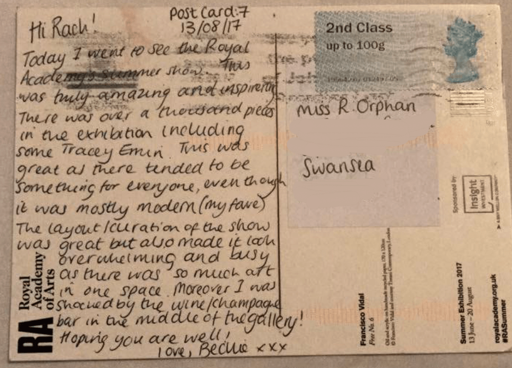
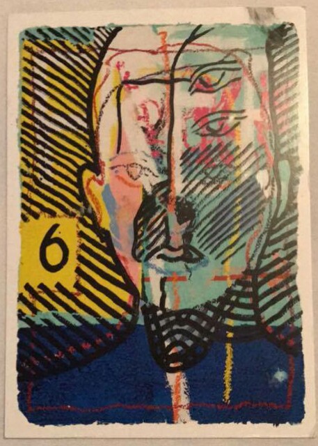
Postcards are the best form of affordable art! When I visit an exhibition that I especially love it is great to buy a postcard as a memento. I am slowly building up an ‘inspiration hoard’ to bring to university with me. This will mostly be made up of postcards from my favourite exhibitions. Below is an example of a book of postcards I bought at a recent Rembrandt exhibition and a postcard Beckie sent me when she went to the RA Summer Exhibition. I will send Beckie and other artist friends postcards I think will inspire them from exhibitions I see this year. It’s a fun way to keep in touch!
 

_20170904_151039

No.3

Over the years my family and I have been sent many postcards from friends and family who are on their holidays. Memorably from a 97 year old friend who recently made me very jealous with a postcard from the Northern Lights! We also continue to send holiday postcards ourselves. Some people wonder what the point is when we can easily send photos over the internet and often arrive home before the postcards. In one particularly memorable case my Aunty Gwyn received a postcard from a trip we went on to Rome a year after we posted it because of the notoriously slow Italian postal service. For reasons of nostalgia and the opportunity to have a handwritten note to show you are remembered by a loved one is reason enough to not let the holiday postcard die out. There are also some fun varieties to try out! When I was in Hungary this summer to test some fun variations I sent Beckie and my family a variety of different postcards:

the giant postcard (An A4 image that baffled the Hungarian postal workers and also doubled as a lovely souvenir as it can be easily displayed.)

the digital postcard ( A postcard created with the app Postsnap that allows you to use your own photos (as a photographer I love this!). It is then printed and sent. A lovely idea to make the postcard even more personal.)

the postcard coaster (Another souvenir/postcard. A beautiful illustrated coaster that can be addressed on the back.) Images below.

No.4

I love freebies! Some of my favourite postcards are those I have got for free. Examples are below.

No. 5

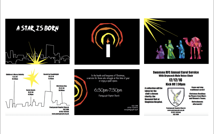
Probably inspired by the above, I created a range of postcards recently for some Christmas events my church was hosting. They are the perfect size for an eye-catching advert! The front and backs of three of these postcards are shown below.
Screen Shot 2017-09-06 at 11.59.44

No.6

And finally, I would like to take the chance to reflect on mine and Beckie’s postal adventure! I have had such a lot of fun creating and receiving postcards. It has challenged me to be creative in so many ways. Our project was inspired by the work of artists Giorgia Lupi and Stefanie Posavec but has become so much more than just a ‘dear data’ experiment. Beckie’s infographic postcards (which can be found on this blog) have taught me so much about her. I am going to use them as inspiration for my infographic work. I hope we can continue to send each other postcards and stay in touch as we start our degrees. Below are some of the postcards and letters I sent to Beckie.

This slideshow requires JavaScript.


Thank you! 

This blog has given me such a lovely opportunity to have a digital space in which I can be creative.

Doing a project with my partner Rachel has given me the inspiration to concentrate on collaboration work in the future. I feel our postcard adventure has been successful and is something I hope we could replicate next summer. Although we are not completely finished, we are coming into the last week of our postcards where it will be time to say goodbye to one another before heading to university.

Throughout my Foundation year, I have discovered that people are a very important aspect to my art. Whether this is working with them or studying them as inspiration to create. I find it difficult to be creative when I am alone as I focus on social art, this is why I particularly enjoyed our project for Elysium Open Studios in July. 

This blog has encouraged me to have my own personal blog for weekly posts to use as a digital sketchbook and portfolio.

I am truly grateful for the opportunity Mission Gallery has given me with the Jane Phillips Award blog. I hope I can work with Mission again in the future.

Thank you! ☺️

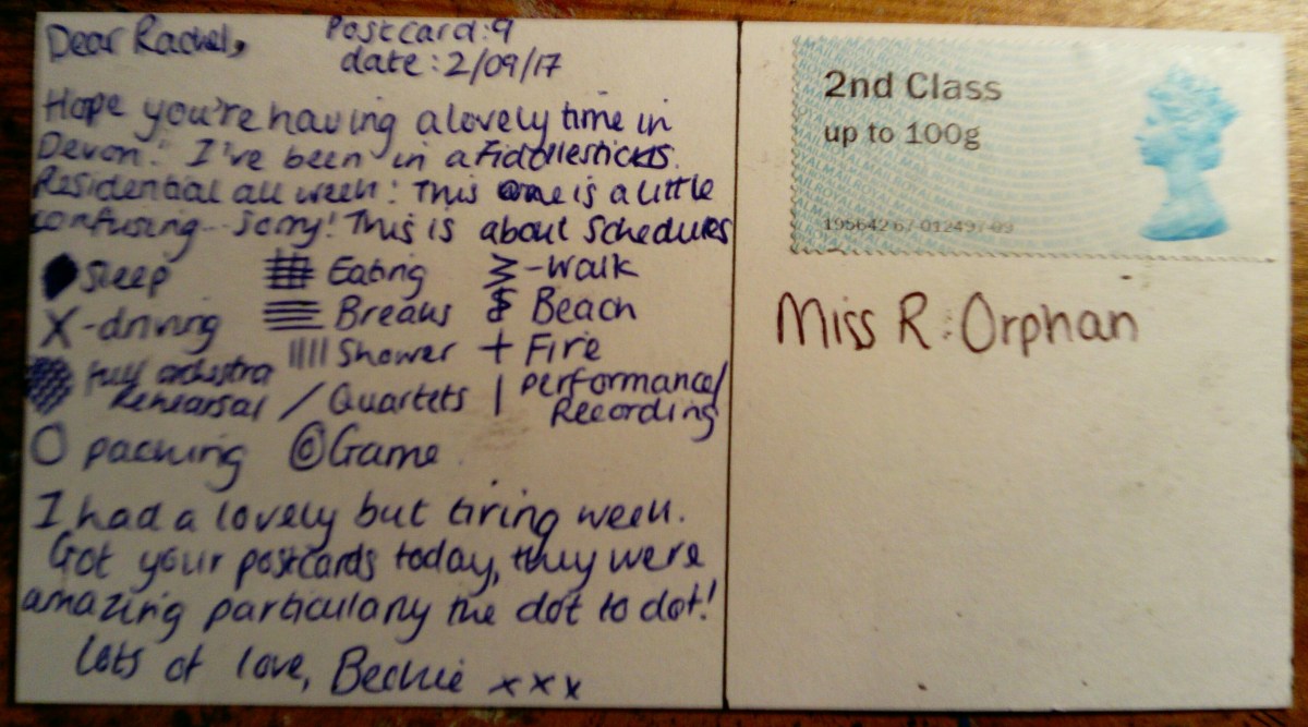
Postcard nine – 2nd September 2017

This postcard was based on Schedules. The inspiration for this came from how structured our Fiddlesticks (orchestra) residential course is. Throughout the four days, I noted down the time we would begin each new activity. 

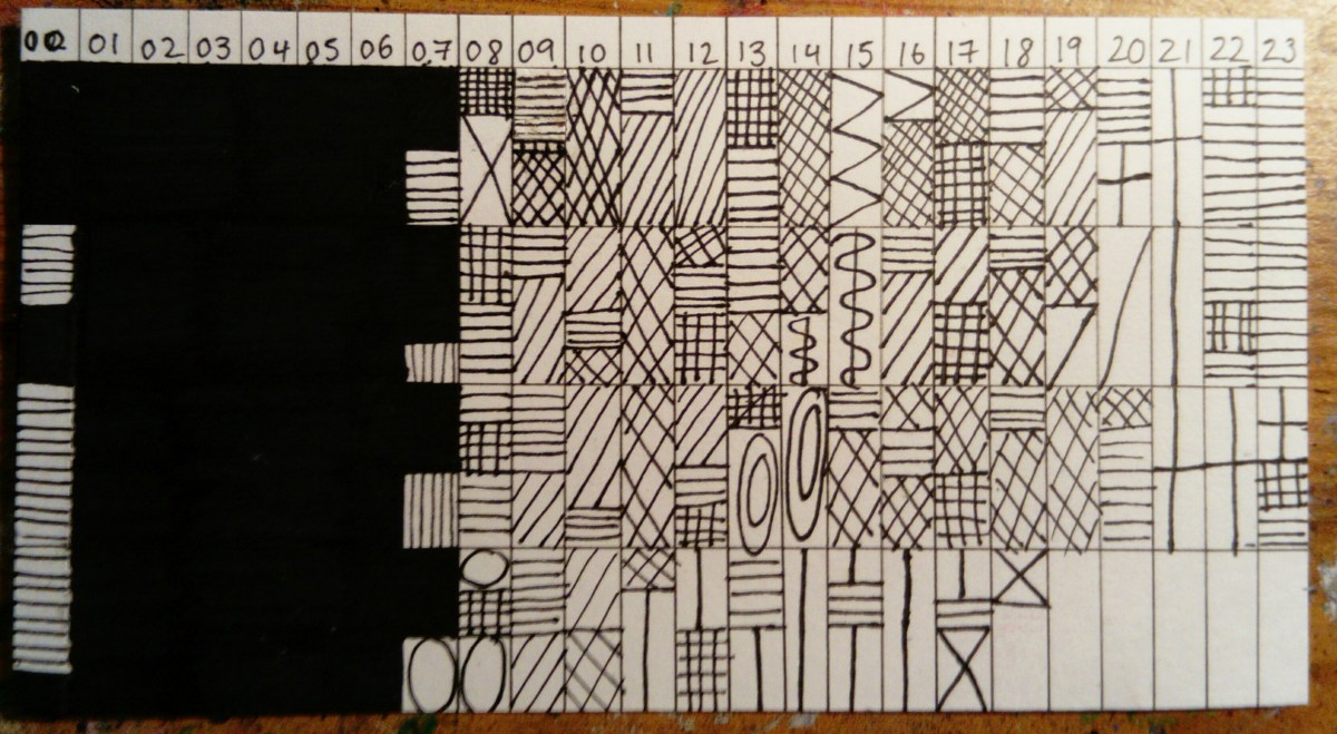
I was struggling with ideas of how to display this particular postcard. Codes, was what came to mind.

As you can see in the image above, I gave each activity a visual symbol or pattern. After doing two days, I was began to see this was quite a complicated and confusing system. However, after testing other styles I continued this as it was still the best idea.

Dear Rachel ~ love Beckie

Documenting Devon

Screen Shot 2017-08-30 at 18.40.31

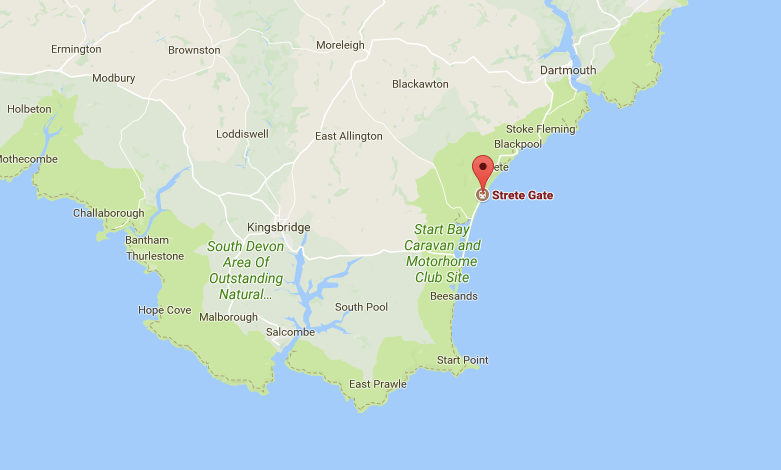
Recently, I spent the day at Strete Gate Beach with my family while on holiday in Devon. I decided to document this day in a variety of different ways. I was unable to get blank postcards so I decided to use envelopes as my starting point. I was challenged by a lack of materials and stimuli. Therefore, it was a fun challenge! Below are the outcomes and the challenges I set myself.


This slideshow requires JavaScript.

Challenges

  1. Beach textures collected and adhered to the envelope
  2. Beach smudges (sun cream/charcoal etc.) and soaked in the sea
  3. Beach smudges (sun cream/charcoal etc.) and soaked in the sea
  4. Portraits of myself and my sister, by myself and my sister (continuous line/blind drawn etc.)
  5. Handdrawn map of surroundings (Inspired by “From Here to There: A Curious Collection from the Hand Drawn Map Association”)
  6. Journey bumps and bends (put pen to paper and see what happens!)
  7. Journey bumps and bends (put pen to paper and see what happens!)
  8. A collection of beach objects to create a mini beach in an envelope (one of these is making its way to Beckie in the post! We will see how it survives.)
  9. Continuous writing for 2 minutes
  10. Blind drawn picture of my dog Rocky


I think my favourite outcome of these mini exercises was the pen journeys. They really reflect the uneven and unexpected pleasure of driving in the countryside. Furthermore, looking at them now they look almost like coastlines. And we were travelling to a beach! They are a loose form of map. I think I could continue to use this practice to record a range of journeys. It might also be interesting to layer a more formal representation of the journey over the top (eg. traced off google maps).

IMG_4668IMG_0829

Postcard VIII – 20th August 2017

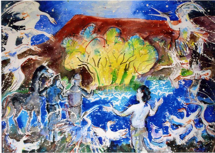
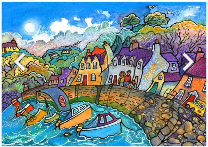
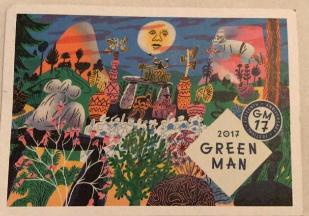
Postcard eight was sent from Greenman Festival. The nearest village to Greenman, is Crickhowell. I went to Crickhowell a few months ago when they had an art festival. I found two local artists Robert Macdonald and Dorian Spencer-Davies. 

Robert Macdonald is a painter and print maker. He often uses bright colours and vivid movements to depict Welsh Landscapes. However, he does not primarily see himself as a landscape artist. He enjoys creating works that contain inner imagination and mythology or legends. 

Dorian Spencer-Davies again uses bright colour but in a very different way. He uses it to compliment his style in which he stretches reality causing a dreamlike state. 

I was impressed with the artwork of the Greenman merchandise this year, with the bands and T-shirts.

They have almost created their own greenman style and language. Through the festival there are symbols to replicate various marks like waterpoints or different stages. Moreover, there is a giant naturally made Greenman creature, this gets remade every year and each is more impressive than the last. Quite an inspiring and artistic festival. 

Dear Rachel ~ love Beckie x

Postcard VII – 13th August 2017

Today’s postcard was a simple one. This was sent from London, I was shocked by the lack of variety of postcards from the exhibition in Royal Academy. However, thought Rachel would like this one.

This is a piece by Francisco Vidal titled Free No. 6. 

The exhibition itself was different from many other exhibitions I’ve been to. The layout seemed overwhelming almost as it featured over a thousand works in an average sized space. This meant that there was no negative space surrounding the works. I enjoy space surrounding as it lends itself to focussing on each work rather than skipping some due to feeling too busy and rushed. That being said, I felt due to the large variety of works there was always something for everyone, since my dad, mum and me all have different opinions of artwork. 

Dear Rachel ~ love Beckie x

Royal Academy – Cornelia Parker

When choosing my most inspiring pieces from Royal Adademy, I noticed I had chosen three different pieces by Cornelia Parker. This was amusing as I am unfamiliar with her work.

Black Path – Cornelia Parker

This is black patinated bronze. This is a thin layer that forms on the surface of stone and metals. It changes the surface, this is usually caused by age but can be caused using certain chemicals. This stood out for me as I was not sure if the piece had been carefully orchestrated or had been a happy accident. This uncertainty forces a fascination with the piece. The bronze has an uneven and rough texture.

Alter Ego (object with unconscious) – Cornelia Parker

These are two silver plated objects, one has been flattened and are suspended by a metal wire. The original purpose has been removed, causing it to no longer be used in such a way however by crushing this you have created a new object. This could be used for decorative ways or even as an unconventional plate. This replicates the name “Alter Ego”, meaning a [person’s] secondary personality. 
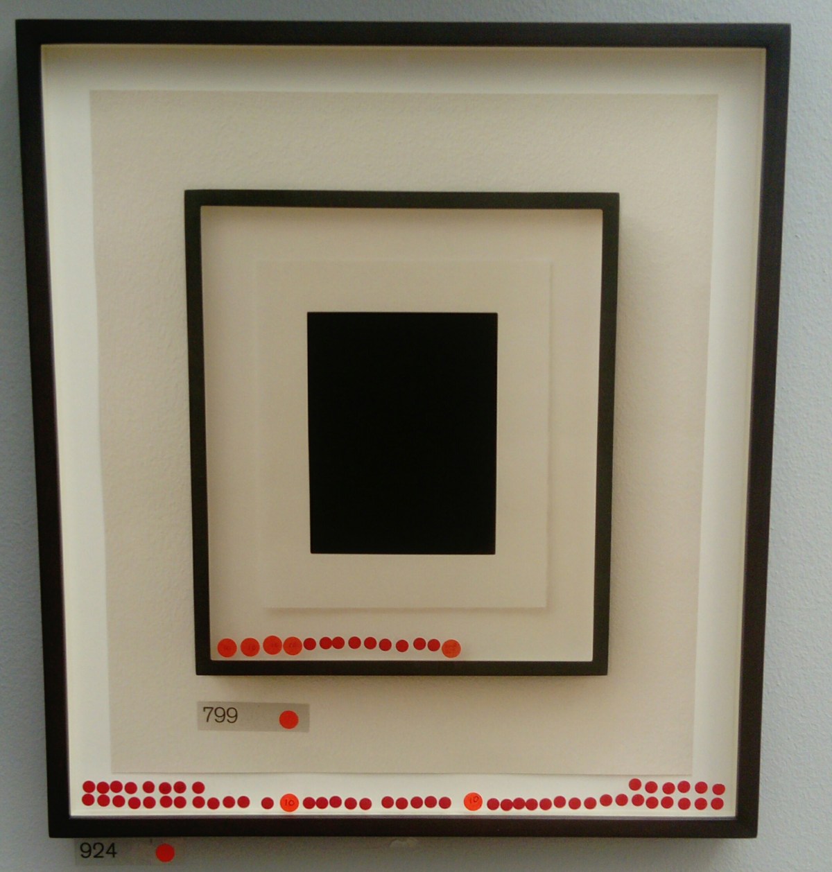
Stolen Thunder (Once Removed) – Cornelia Parker

This is a ditital print of a photograph from a previous exhibition that Parker has taken. In Royal Adademy, red dots represented sales.

In 2012 Parker photographed the most successful piece in the RA show. Parker digitally erased the image she has stolen by exhibiting it as her own the following year. This caused a series of these works, including this of which I saw in this year’s exhibition. 

Royal Academy London! 

Whilst in London I went to view the Royal Adademy’s Summer show. This was truly inspiring, there were over a thousand works within the show. I’ve chosen a handful to do further research into.

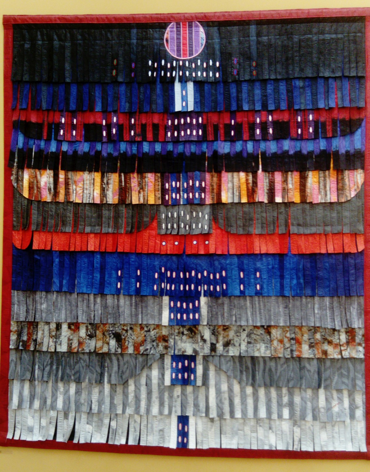
Poupée Bleue – Abdoulaye Konaté

Konaté uses a textile based medium to explore both political and environmental issues. He questions the way in which individuals and societies have been affected by impacts such as war, power, religion and globalisation.

This piece was made using materials. These fabric pieces have been died, creating a crumpled effect either by combining two or three different colours or different shades of the same colour. These have been made into strips, sewn and placed in a particular pattern on the board. This was very beautiful, and I am amazed by the time and effort placed into making this.

Broken Promises – Basil Beattie

This piece was oil paint and wax on canvas. This painting depicts a staircase, he often uses architectural motifs to link with the psychological and physical issues of his work. The pallet is dark making these red and gray stairs stand out for the viewer. This piece could affect and upset the audience as you can see the physical strain on the staircase, how it has collapsed. This then could be reflected with everyday life, how someone could struggle mentally or physically with something around them.

Swell – Sara Dodd

This piece was beautifully executed in its use of material. This has been created using porcelain. By layering the ripped edges, it has created a thick texture. Porcelain is a typically fragile material however this thick texture conveys strong and stable causing a large juxtaposition between fragility and security. 

Instagram

In a continuation from my post on labels, I will be examining another area of my practice…

Instagram 

Instagram is a social media platform where users share images and short videos with their followers. There are around 500 million active users. It is therefore a perfect place for businesses, artists and influencers to access a global (often millennial) audience. However, with an average of 95 million photos and videos being uploaded every day, the curation of content has never been more important.

How I use Instagram now

Date Started: 18/07/15

Date Now: 08/08/17

Number of days used: 752

Post Regularity : post on average every 3.9 days

Followers: 271

Following: 1,207


meta-chart

Findings: I post on a wide variety of subjects and this does lead to a lack of professionalism and continuity on my feed. I post far more often when I am away from home. Therefore, I need to go to more effort to create beautiful images while at home. I feel that my art/design work is lost amongst other images, of my dog for example. I don’t want to lose the fun in posting so I think a separate more design focussed account is what I need. I will keep my personal account active too.

Inspiration and Ideas

Flat Lays

I would love to experiment with taking some flat lays. I first started thinking about this at the Natural History Museum in Oxford (I discuss this trip more in this post). I was taking images of exhibits in cases from above and finding the combination of objects and drawings very aesthetically pleasing. Furthermore, the camera angle seemed an effective one for taking a clean, shadow free image.  Flat lays are images that are taken from above and are often of beautifully curated objects. They are popular on Instagram among fashion and lifestyle bloggers. Experimenting with this would fuse two of my interests: photography and objects. It would be a great way to photograph the tools I use in my work and my favourite things. Below are some inspirational images.


Mood Board

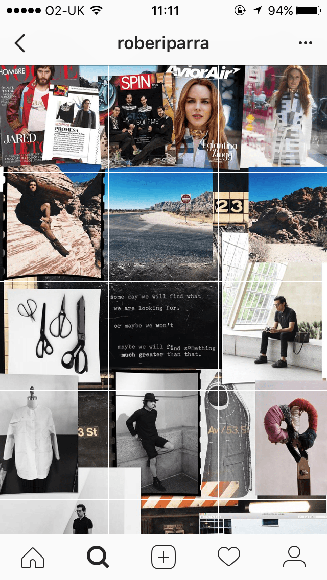
I have always enjoyed collage as an art form and being asked to create a mood board at the start of a project is a dream! I have been looking for some more unusual Instagram layouts and came across the fashion designer Roberi Parra. His feed when looked at as a whole resembles a mood board. It is a well curated collage of images and text. This sort of layout appeals to me in several ways Firstly, because it would ensure that there was a lot of thought put into each post. Despite the mood board effect only being visible when you view his entire page, each post is still beautiful. Secondly, as we begin to digitalise everything, creating a tactile and physical mood board before uploading it to Instagram would ensure I still have a physical connection to my work.

IMG_2427IMG_2428IMG_2426

Time Lapse and Work in Progress

Inspired especially by printmaker Aftyn Shah I thought it would be good to try and include more of my work in progress. This is not something I have considered doing before but it would give my followers more of an insight into my practice. Furthermore, it would mean I could use my feed to look at how work has progressed. Shah is also very good at including objects (such as plants and tools) around her work in images that don’t detract but complemeant. I would like to also take inspiration from this.

A bold colour scheme

One of the best ways to catch a person’s eye and to inject some joy into the world in my opinion is through colour! I am hoping to develop a bold colour scheme for my new design feed perhaps using some turquoise and pink (one of my favourite colour combinations). Art Director Andoni Beristain has an Instagram feed that makes me happy to look at. It is cohesive and professional but also joyful! It is important to inject a bit of personality into any platform that is showing your work.

IMG_2432

That’s all for now. I will post again once I have started to implement some of the above ideas.