Thank you! 

This blog has given me such a lovely opportunity to have a digital space in which I can be creative.

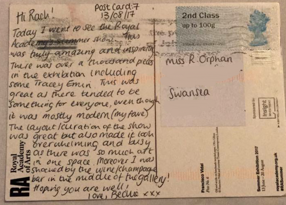
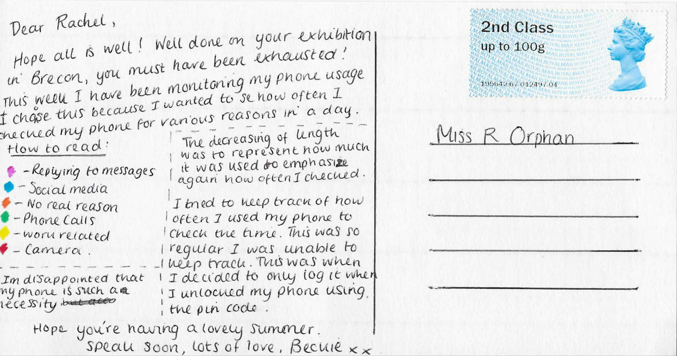
Doing a project with my partner Rachel has given me the inspiration to concentrate on collaboration work in the future. I feel our postcard adventure has been successful and is something I hope we could replicate next summer. Although we are not completely finished, we are coming into the last week of our postcards where it will be time to say goodbye to one another before heading to university.

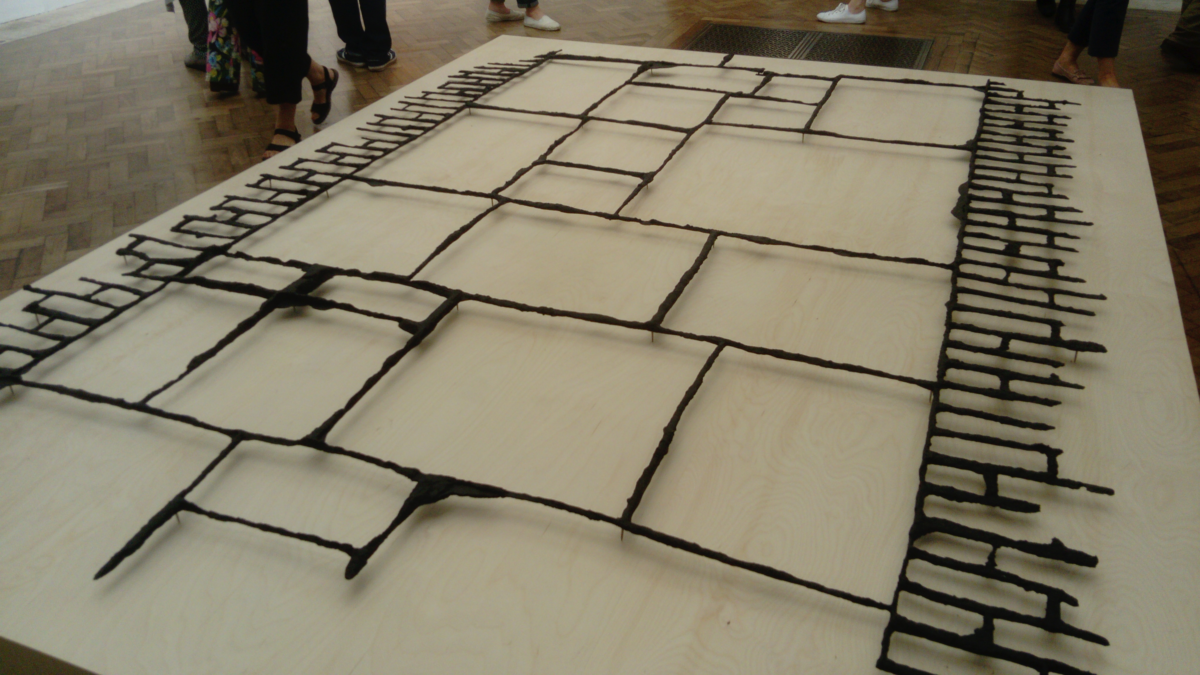
Throughout my Foundation year, I have discovered that people are a very important aspect to my art. Whether this is working with them or studying them as inspiration to create. I find it difficult to be creative when I am alone as I focus on social art, this is why I particularly enjoyed our project for Elysium Open Studios in July. 

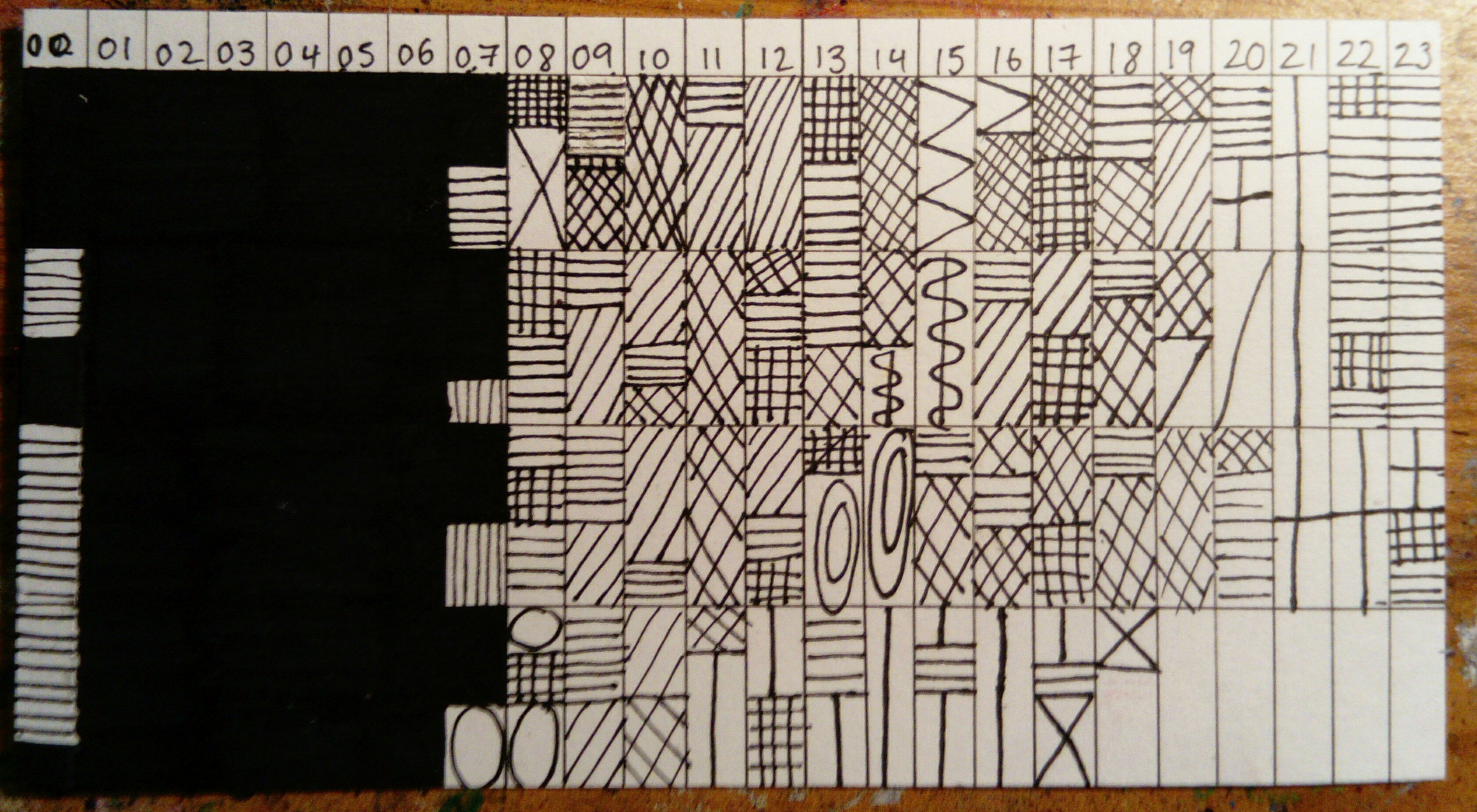
This blog has encouraged me to have my own personal blog for weekly posts to use as a digital sketchbook and portfolio.

I am truly grateful for the opportunity Mission Gallery has given me with the Jane Phillips Award blog. I hope I can work with Mission again in the future.

Thank you! ☺️

Postcard nine – 2nd September 2017

This postcard was based on Schedules. The inspiration for this came from how structured our Fiddlesticks (orchestra) residential course is. Throughout the four days, I noted down the time we would begin each new activity. 

I was struggling with ideas of how to display this particular postcard. Codes, was what came to mind.

As you can see in the image above, I gave each activity a visual symbol or pattern. After doing two days, I was began to see this was quite a complicated and confusing system. However, after testing other styles I continued this as it was still the best idea.

Dear Rachel ~ love Beckie

Postcard VIII – 20th August 2017

Postcard eight was sent from Greenman Festival. The nearest village to Greenman, is Crickhowell. I went to Crickhowell a few months ago when they had an art festival. I found two local artists Robert Macdonald and Dorian Spencer-Davies. 

Robert Macdonald is a painter and print maker. He often uses bright colours and vivid movements to depict Welsh Landscapes. However, he does not primarily see himself as a landscape artist. He enjoys creating works that contain inner imagination and mythology or legends. 

Dorian Spencer-Davies again uses bright colour but in a very different way. He uses it to compliment his style in which he stretches reality causing a dreamlike state. 

I was impressed with the artwork of the Greenman merchandise this year, with the bands and T-shirts.

They have almost created their own greenman style and language. Through the festival there are symbols to replicate various marks like waterpoints or different stages. Moreover, there is a giant naturally made Greenman creature, this gets remade every year and each is more impressive than the last. Quite an inspiring and artistic festival. 

Dear Rachel ~ love Beckie x

Postcard VII – 13th August 2017

Today’s postcard was a simple one. This was sent from London, I was shocked by the lack of variety of postcards from the exhibition in Royal Academy. However, thought Rachel would like this one.

This is a piece by Francisco Vidal titled Free No. 6. 

The exhibition itself was different from many other exhibitions I’ve been to. The layout seemed overwhelming almost as it featured over a thousand works in an average sized space. This meant that there was no negative space surrounding the works. I enjoy space surrounding as it lends itself to focussing on each work rather than skipping some due to feeling too busy and rushed. That being said, I felt due to the large variety of works there was always something for everyone, since my dad, mum and me all have different opinions of artwork. 

Dear Rachel ~ love Beckie x

Royal Academy – Cornelia Parker

When choosing my most inspiring pieces from Royal Adademy, I noticed I had chosen three different pieces by Cornelia Parker. This was amusing as I am unfamiliar with her work.

Black Path – Cornelia Parker

This is black patinated bronze. This is a thin layer that forms on the surface of stone and metals. It changes the surface, this is usually caused by age but can be caused using certain chemicals. This stood out for me as I was not sure if the piece had been carefully orchestrated or had been a happy accident. This uncertainty forces a fascination with the piece. The bronze has an uneven and rough texture.

Alter Ego (object with unconscious) – Cornelia Parker

These are two silver plated objects, one has been flattened and are suspended by a metal wire. The original purpose has been removed, causing it to no longer be used in such a way however by crushing this you have created a new object. This could be used for decorative ways or even as an unconventional plate. This replicates the name “Alter Ego”, meaning a [person’s] secondary personality. 
Stolen Thunder (Once Removed) – Cornelia Parker

This is a ditital print of a photograph from a previous exhibition that Parker has taken. In Royal Adademy, red dots represented sales.

In 2012 Parker photographed the most successful piece in the RA show. Parker digitally erased the image she has stolen by exhibiting it as her own the following year. This caused a series of these works, including this of which I saw in this year’s exhibition. 

Royal Academy London! 

Whilst in London I went to view the Royal Adademy’s Summer show. This was truly inspiring, there were over a thousand works within the show. I’ve chosen a handful to do further research into.

Poupée Bleue – Abdoulaye Konaté

Konaté uses a textile based medium to explore both political and environmental issues. He questions the way in which individuals and societies have been affected by impacts such as war, power, religion and globalisation.

This piece was made using materials. These fabric pieces have been died, creating a crumpled effect either by combining two or three different colours or different shades of the same colour. These have been made into strips, sewn and placed in a particular pattern on the board. This was very beautiful, and I am amazed by the time and effort placed into making this.

Broken Promises – Basil Beattie

This piece was oil paint and wax on canvas. This painting depicts a staircase, he often uses architectural motifs to link with the psychological and physical issues of his work. The pallet is dark making these red and gray stairs stand out for the viewer. This piece could affect and upset the audience as you can see the physical strain on the staircase, how it has collapsed. This then could be reflected with everyday life, how someone could struggle mentally or physically with something around them.

Swell – Sara Dodd

This piece was beautifully executed in its use of material. This has been created using porcelain. By layering the ripped edges, it has created a thick texture. Porcelain is a typically fragile material however this thick texture conveys strong and stable causing a large juxtaposition between fragility and security. 

Postcard VI – 5th August 2017

The past two weeks, I have been continuing my part time job whilst doing a two week summer playscheme for kids. I have done this every year for four years and used to do this as child. This hasn’t given me much free time therefore I decided to monitor how often I got painted as it is very common to get paint three or four times through the ten days. 

This year I got pained five out of ten days. 

  • 24th July – Grey and white, over the face.
  • 27th July – Blue, pink and purple paint brush lines, across the face and neck.
  • 31st July – Dark blue, whole body (hair to toes, including clothes).
  • 1st August – Clown facepaint. 
  • 4th August – Spiderman facepaint.

I wanted to replicate the style and colours in which I had been painted onto this postcard. Using facepaint, I sponged some of the basic colours down like gray/white, dark blue and red. As I didn’t want to paint a clown, I sponged the colours used all close together. I then used a paint brush to do spider like web’s on top of the red and I created lines similarly to how it appeared on my face.

I really enjoyed playscheme however exhausting it can make me. I hope this postcard shows how fun and playful it can be. 

Postcard V – 23rd July 2017

This week I monitored my phone usage. For five days I recorded how many times I used my phone. In order to keep track I noted these using gates on my arm.

Moreover I wanted to monitor what I was using my phone for. The categories were as follows:

  • Checking the time
  • Replying to messages
  • Social media
  • No real reason
  • Phone calls
  • Work-related
  • Camera

After half a day, I realised how difficult it was to keep track of how often I checked the time as it was so frequent. I decided to remove this category and only recorded when I unlocked my phone using its password. 

I did test pieces using different ways I could display this; I began with a ring idea.

After seven circles, I realised this was not going to work as there would be five days with on average 40 checks. I then tried a bar graph style.

This would have worked very well if I had also monitored in which order I used the sections; for example messages, camera call, messages, call, work etc. 

This was the finished postcard. This was the most effective and efficient way of reflecting my data. I was disappointed with how often I go to use my phone and how much of an necessity it is to my life.

To Rachel ~ love Beckie 

Sketchbook pages

These are pages from my Sketchbook after the Elysium Open Studios.

As part of the collaboration, we had to use a disposable camera and post-its to document what we were doing at 3 o’clock each day. These were the photographs and post-its from Days Nine and Ten (4th and 5th July). 

I was leaving for work on day nine (left). This was a very quick snap of my steering wheel. Later on in the evening I took a rubbing of the wheel on a post-it using crayon.

On day ten (right), I was in the process of creating a “Thank you” card for a family friend. As I was using an ink and wash technique, I decided to use this sheet in order to get the correct shades of wash without using pen directly on the drawing.

I found days Eleven and Twelve (6th and 7th July) interesting post-its. Both days I was busily in the middle of something. Therefore quick thinking was needed for the post-its.

On day Eleven (top), I was making progress with tidying my bedroom. I used the bits of rubbish that I found hidden away and glued them to the post-it.

Day Twelve (bottom) I has taken my dog for a walk. Unable to stop and think about a way of representing it, I grabbed some grass from the recently mowed field.

Both of these post-its are textured and formed so that it becomes interactive art where people may want to touch and feel it.

Postcard IV – 7th July 2017

The purpose of my fourth postcard was inspired by Radio One’s competition week. Whatever the prize or competition it was always involving ‘words’ usually where you were to listen out for a particular word. I decided to use my conversations via Facebook, text, WhatsApp etc. to see how often I spoke about myself, the other person and referenced time.

Time = 56 times

Myself = 61 times

The other person = 83 times

It concerns me how often time was discussed within seven days. After researching, I discovered that the word ‘time’ appeared in the top 50 most commonly used words in the English language. This encouraged me to monitor how often I used it. Although I had to widened this so it became references to time eg. days, months, years and numbers rather than the word time.

To layout this information, I consisted using coloured lines. 

Each continuous coloured line being the length of the result. This however didn’t fully replicate the purpose of the postcard or the data collected. Instead I drew from a theme I was exploring as part if my final major project within foundation which involved shape outlines. Moreover, after testing this with felt tips I decided to use embroidery silks sewing the shapes in. I used a different technique for each colour to further emphasise the different sections. 

The green (representing time) is a basic running stitch. 

The yellow (representing myself) is a back stitch.

The orange/brown (representing the other person) is a laced running stitch.

Each of these were basic stitches, I felt this as best as the paper was thick and became extremely difficult to see into. 

Dear Rachel ~ love Beckie

Ink wash practice

In order to keep my drawing skills up I decided to do an pen and wash study of flowers. This was a observational drawing from my garden. Observational drawings keep your mind focused on what is in front of you rather than what is on a screen, moreover they teach you how to avoid making this look 2D.

The intention of this was to also keep my hand from becoming lazy over the Summer. I was relatively pleased with the outcome, however this drawing isn’t grounded into its setting. This is something I wish to work on on the future. 

Chinese Crested Dog

I thought I would begin with a small quick sketch of a Chinese Crested dog. This was as a gift to an ill family friend who has always loved these dogs. 

I enjoyed using pencils again, as it’s something I have been trying to use little of throughout this year. Foundation has caused me to try new things, moreover the break from tonal drawings has been good as I was loosing enjoyment of what I was doing.