Post and Postcards

In this post I will be further examining my practise by looking at my fascination with post and postcards. In previous posts I have looked at other tools I use in my work such as Labels and Instagram 

I have always loved getting post! I sign up for as many catalogues as I can to feed my obsession. I wrote to the Queen when I was 11 and was overwhelmed by the beautiful gold stationery that housed the response. Furthermore, every Christmas I receive a parcel that excites me more than any other. It is from a friend in Japan. It amazes me how different the stationary is, the parcel is packaged, and the postal service labels are. Recently, I have been sorting through my massive postcard collection and have found that 148 x 105 mm or 5.8 x 4.1 inches (the standard size of a postcard) is perfect for so many things. Below, I will show some examples of postcards from my collection and postal experiments I have been trying.

NO.1

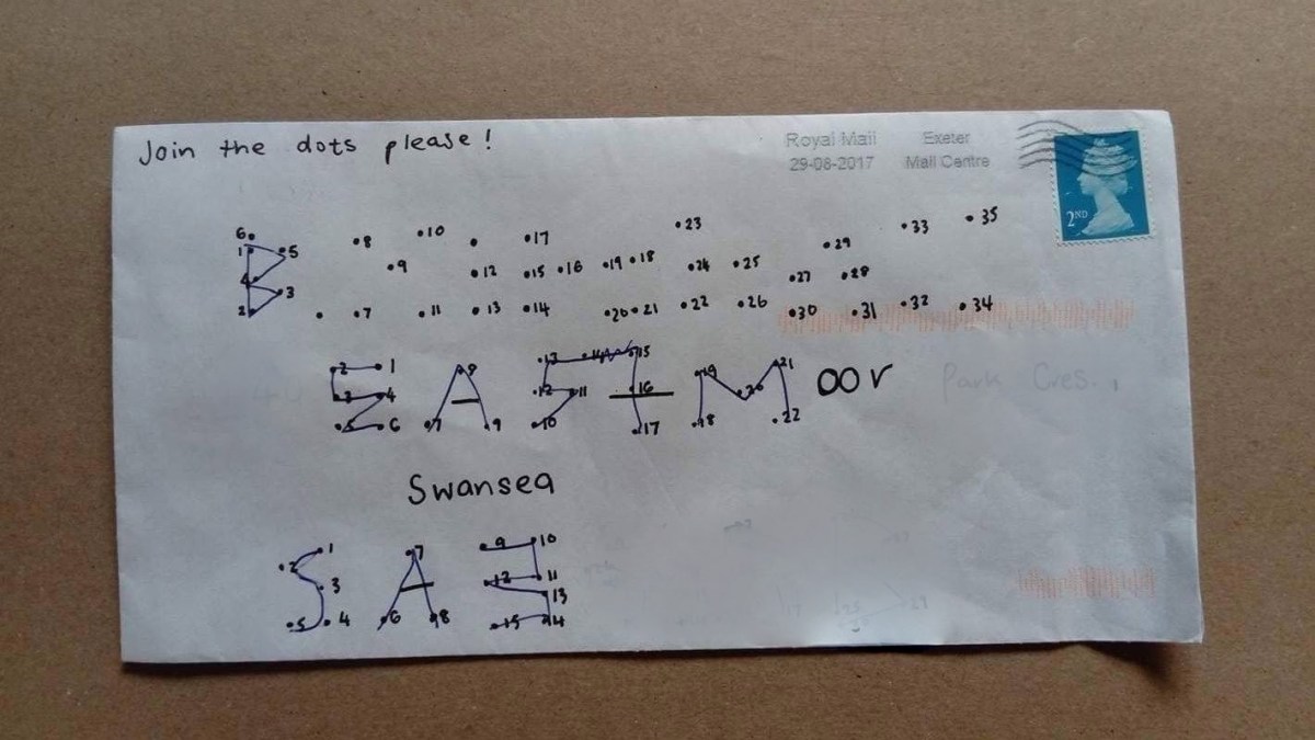
I was introduced to the book “The Englishman Who Posted Himself and Other Curious Objects” and the work of W. Reginald Bray during my foundation course. I read and began trying out some of his experiments for myself as a personal project.

W. Reginald Bray

“In 1898, Bray purchased a copy of the Post Office Guide, and began to study the regulations published quarterly by the British postal authorities. He discovered that the smallest item one could post was a bee, and the largest, an elephant. Intrigued, he decided to experiment with sending ordinary and strange objects through the post unwrapped, including a turnip, abowler hat, a bicycle pump, shirt cuffs, seaweed, a clothes brush, even a rabbit’s skull. He eventually posted his Irish terrier and himself (not together), earning him the name “The Human Letter.” He also mailed cards to challenging addressessome in the form of picture puzzles, others sent to ambiguous recipients at hard to reach destinationsall in the name of testing the deductive powers of the beleaguered postman.”

Examples of some of my successfully posted and yet unposted work can be found below.

IMG_0359IMG_6612IMG_1083IMG_5903

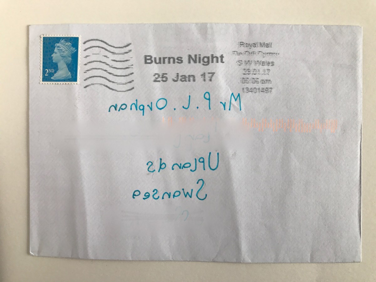
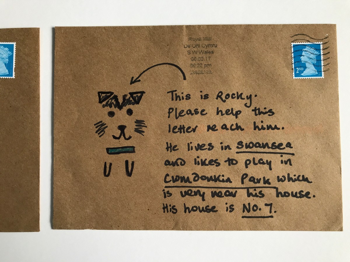
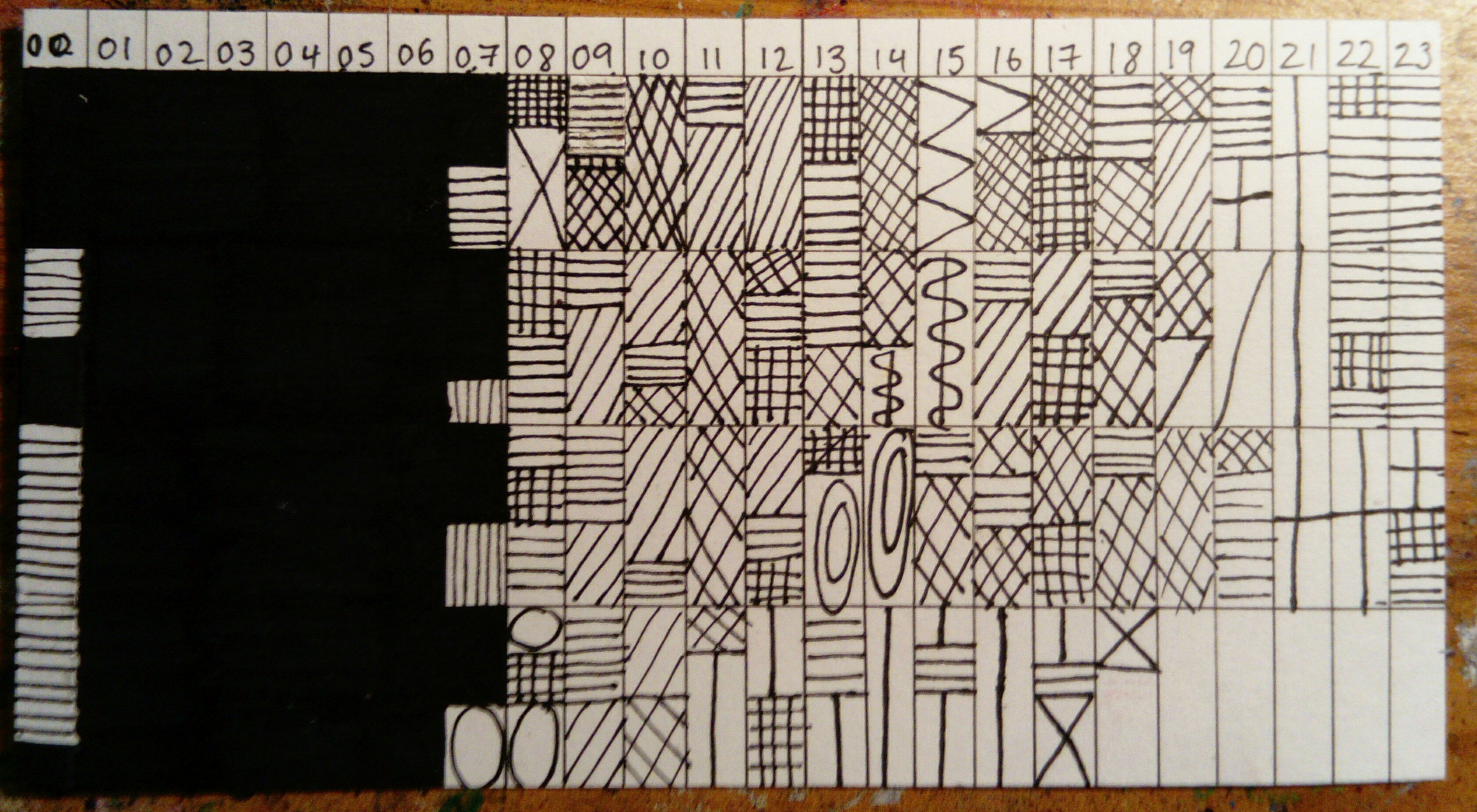
I think I will continue to enjoy taking inspiration from Bray’s work. A few weeks ago, I discovered an artist who has a similar passion for testing the postal service. Examples of Harriet Russell’s work can be found below along with a surprisingly  successful piece I created in Russell’s style and sent to Beckie. I am already planning my next challenge.


IMG_3096

NO.2 

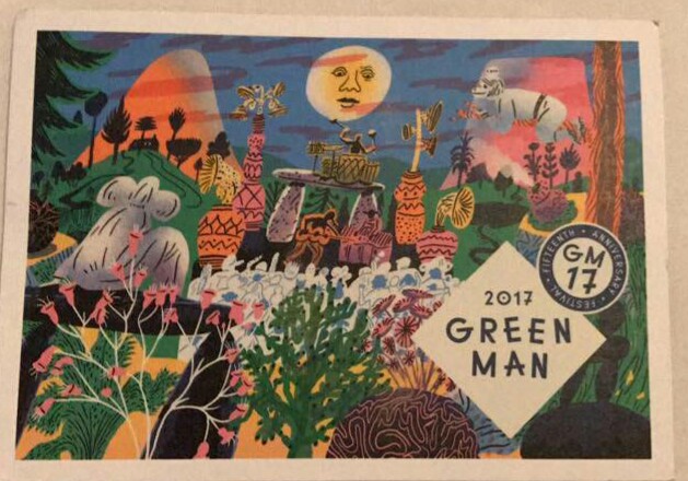
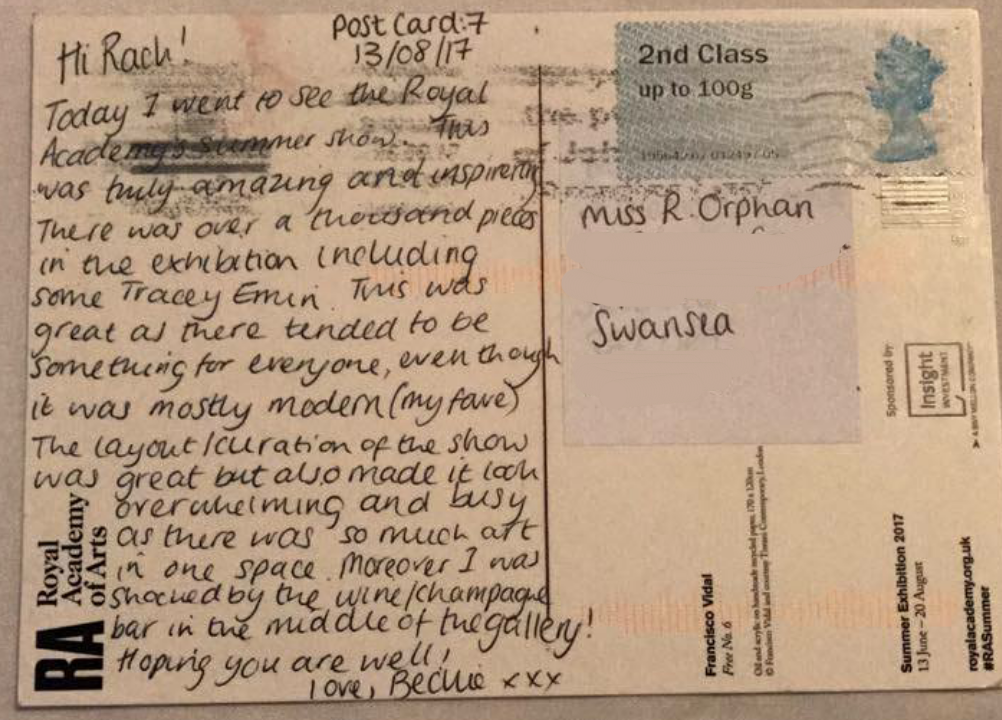
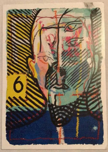
Postcards are the best form of affordable art! When I visit an exhibition that I especially love it is great to buy a postcard as a memento. I am slowly building up an ‘inspiration hoard’ to bring to university with me. This will mostly be made up of postcards from my favourite exhibitions. Below is an example of a book of postcards I bought at a recent Rembrandt exhibition and a postcard Beckie sent me when she went to the RA Summer Exhibition. I will send Beckie and other artist friends postcards I think will inspire them from exhibitions I see this year. It’s a fun way to keep in touch!


_20170904_151039

No.3

Over the years my family and I have been sent many postcards from friends and family who are on their holidays. Memorably from a 97 year old friend who recently made me very jealous with a postcard from the Northern Lights! We also continue to send holiday postcards ourselves. Some people wonder what the point is when we can easily send photos over the internet and often arrive home before the postcards. In one particularly memorable case my Aunty Gwyn received a postcard from a trip we went on to Rome a year after we posted it because of the notoriously slow Italian postal service. For reasons of nostalgia and the opportunity to have a handwritten note to show you are remembered by a loved one is reason enough to not let the holiday postcard die out. There are also some fun varieties to try out! When I was in Hungary this summer to test some fun variations I sent Beckie and my family a variety of different postcards:

the giant postcard (An A4 image that baffled the Hungarian postal workers and also doubled as a lovely souvenir as it can be easily displayed.)

the digital postcard ( A postcard created with the app Postsnap that allows you to use your own photos (as a photographer I love this!). It is then printed and sent. A lovely idea to make the postcard even more personal.)

the postcard coaster (Another souvenir/postcard. A beautiful illustrated coaster that can be addressed on the back.) Images below.

No.4

I love freebies! Some of my favourite postcards are those I have got for free. Examples are below.

No. 5

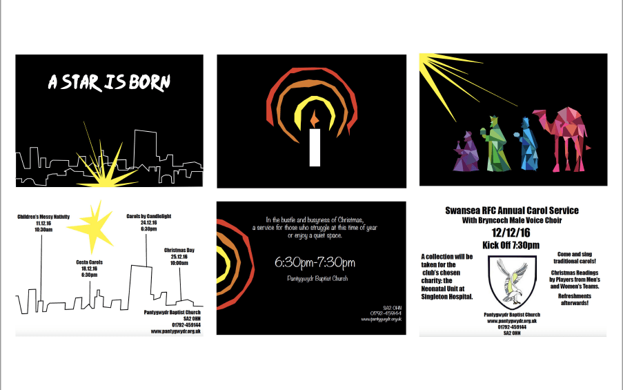
Probably inspired by the above, I created a range of postcards recently for some Christmas events my church was hosting. They are the perfect size for an eye-catching advert! The front and backs of three of these postcards are shown below.

Screen Shot 2017-09-06 at 11.59.44

No.6

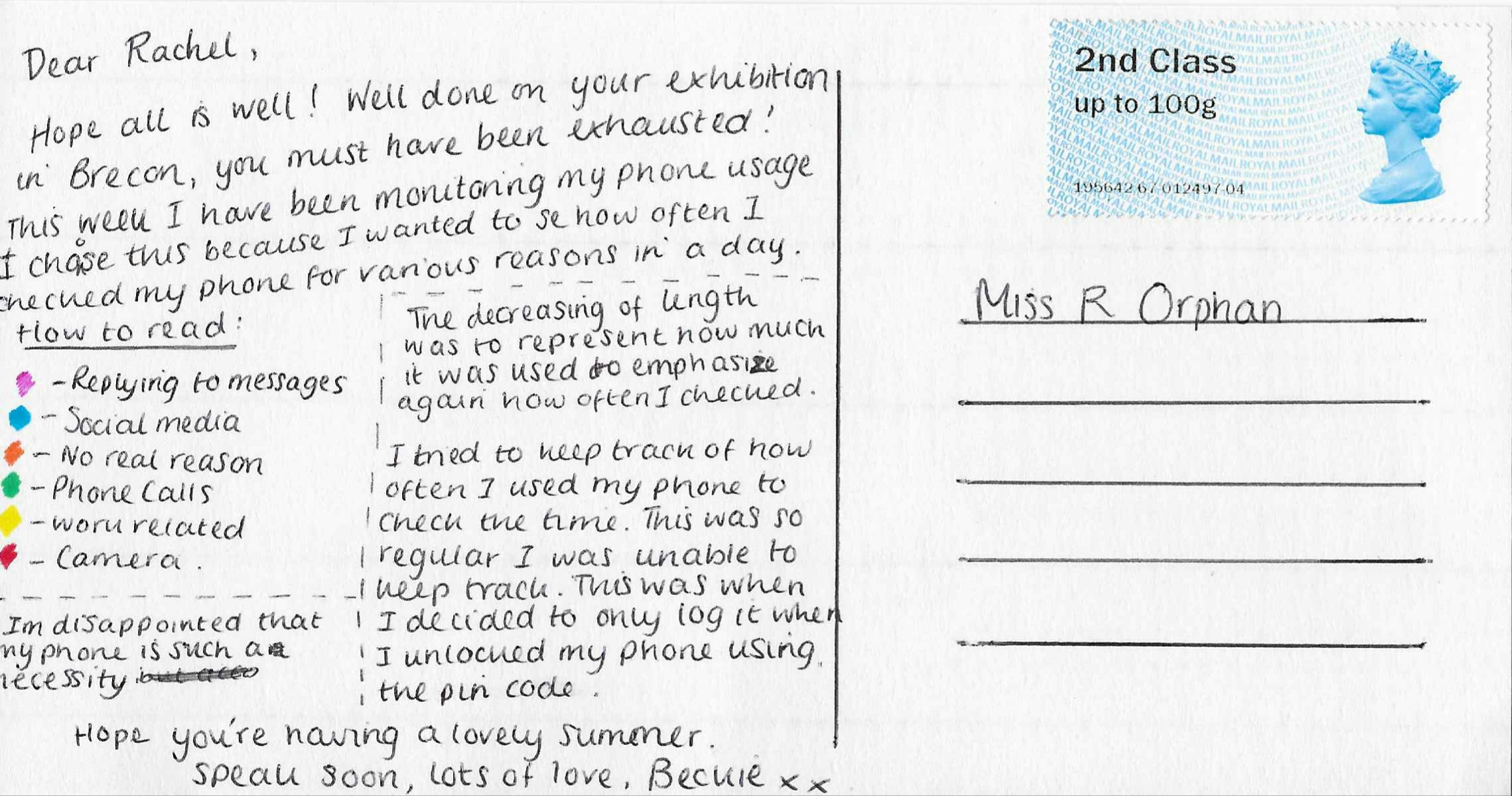
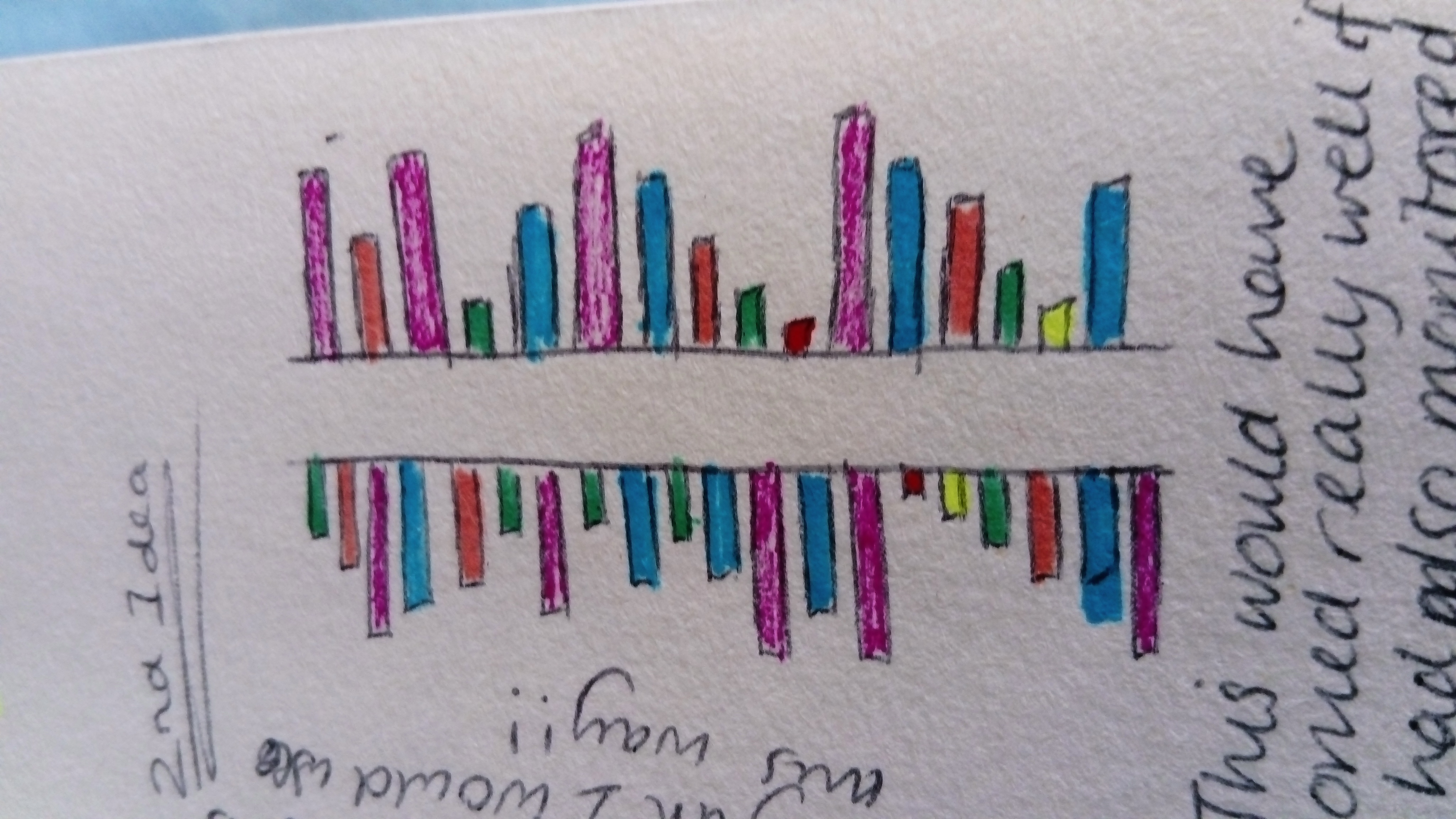
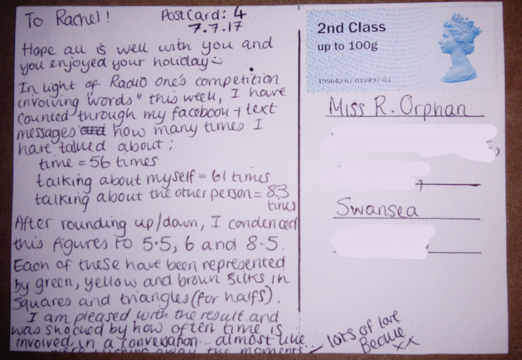
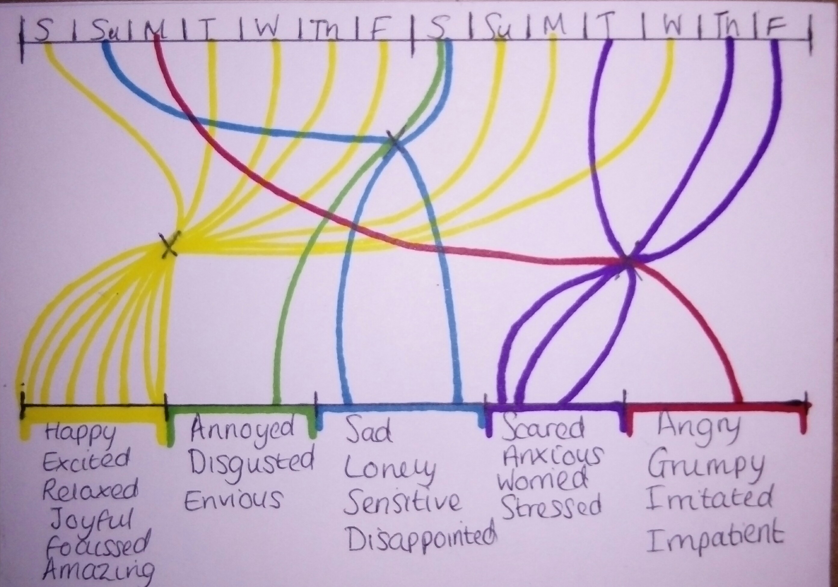
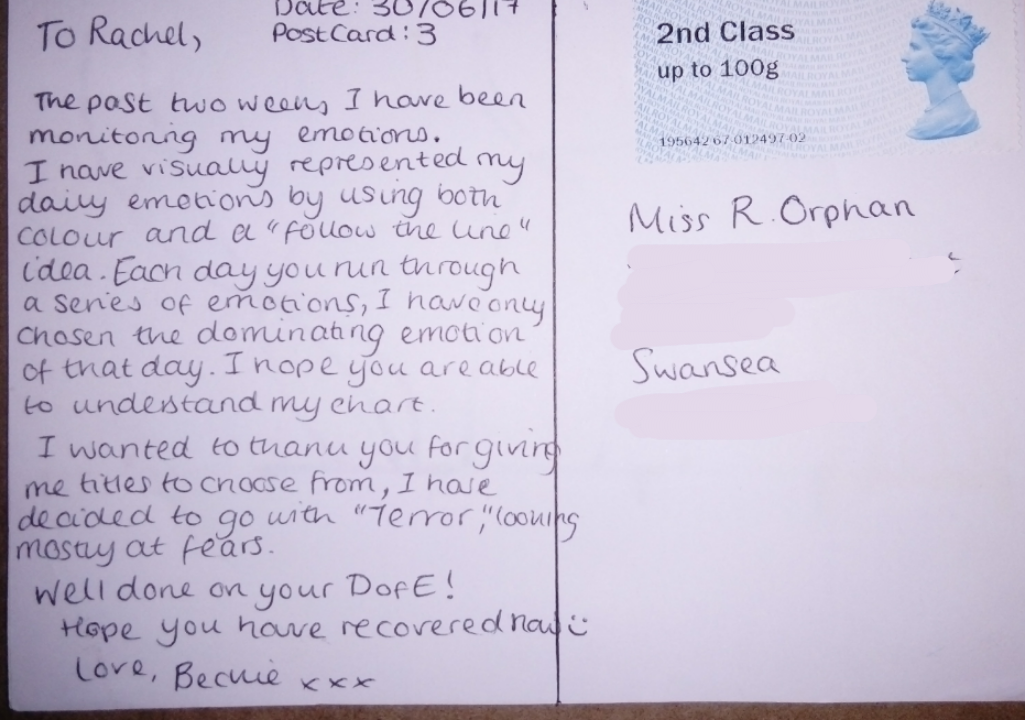
And finally, I would like to take the chance to reflect on mine and Beckie’s postal adventure! I have had such a lot of fun creating and receiving postcards. It has challenged me to be creative in so many ways. Our project was inspired by the work of artists Giorgia Lupi and Stefanie Posavec but has become so much more than just a ‘dear data’ experiment. Beckie’s infographic postcards (which can be found on this blog) have taught me so much about her. I am going to use them as inspiration for my infographic work. I hope we can continue to send each other postcards and stay in touch as we start our degrees. Below are some of the postcards and letters I sent to Beckie.

This slideshow requires JavaScript.


Postcard nine – 2nd September 2017

This postcard was based on Schedules. The inspiration for this came from how structured our Fiddlesticks (orchestra) residential course is. Throughout the four days, I noted down the time we would begin each new activity. 

I was struggling with ideas of how to display this particular postcard. Codes, was what came to mind.

As you can see in the image above, I gave each activity a visual symbol or pattern. After doing two days, I was began to see this was quite a complicated and confusing system. However, after testing other styles I continued this as it was still the best idea.

Dear Rachel ~ love Beckie

Postcard VIII – 20th August 2017

Postcard eight was sent from Greenman Festival. The nearest village to Greenman, is Crickhowell. I went to Crickhowell a few months ago when they had an art festival. I found two local artists Robert Macdonald and Dorian Spencer-Davies. 

Robert Macdonald is a painter and print maker. He often uses bright colours and vivid movements to depict Welsh Landscapes. However, he does not primarily see himself as a landscape artist. He enjoys creating works that contain inner imagination and mythology or legends. 

Dorian Spencer-Davies again uses bright colour but in a very different way. He uses it to compliment his style in which he stretches reality causing a dreamlike state. 

I was impressed with the artwork of the Greenman merchandise this year, with the bands and T-shirts.

They have almost created their own greenman style and language. Through the festival there are symbols to replicate various marks like waterpoints or different stages. Moreover, there is a giant naturally made Greenman creature, this gets remade every year and each is more impressive than the last. Quite an inspiring and artistic festival. 

Dear Rachel ~ love Beckie x

Postcard VII – 13th August 2017

Today’s postcard was a simple one. This was sent from London, I was shocked by the lack of variety of postcards from the exhibition in Royal Academy. However, thought Rachel would like this one.

This is a piece by Francisco Vidal titled Free No. 6. 

The exhibition itself was different from many other exhibitions I’ve been to. The layout seemed overwhelming almost as it featured over a thousand works in an average sized space. This meant that there was no negative space surrounding the works. I enjoy space surrounding as it lends itself to focussing on each work rather than skipping some due to feeling too busy and rushed. That being said, I felt due to the large variety of works there was always something for everyone, since my dad, mum and me all have different opinions of artwork. 

Dear Rachel ~ love Beckie x

Postcard VI – 5th August 2017

The past two weeks, I have been continuing my part time job whilst doing a two week summer playscheme for kids. I have done this every year for four years and used to do this as child. This hasn’t given me much free time therefore I decided to monitor how often I got painted as it is very common to get paint three or four times through the ten days. 

This year I got pained five out of ten days. 

  • 24th July – Grey and white, over the face.
  • 27th July – Blue, pink and purple paint brush lines, across the face and neck.
  • 31st July – Dark blue, whole body (hair to toes, including clothes).
  • 1st August – Clown facepaint. 
  • 4th August – Spiderman facepaint.

I wanted to replicate the style and colours in which I had been painted onto this postcard. Using facepaint, I sponged some of the basic colours down like gray/white, dark blue and red. As I didn’t want to paint a clown, I sponged the colours used all close together. I then used a paint brush to do spider like web’s on top of the red and I created lines similarly to how it appeared on my face.

I really enjoyed playscheme however exhausting it can make me. I hope this postcard shows how fun and playful it can be. 

Postcard V – 23rd July 2017

This week I monitored my phone usage. For five days I recorded how many times I used my phone. In order to keep track I noted these using gates on my arm.

Moreover I wanted to monitor what I was using my phone for. The categories were as follows:

  • Checking the time
  • Replying to messages
  • Social media
  • No real reason
  • Phone calls
  • Work-related
  • Camera

After half a day, I realised how difficult it was to keep track of how often I checked the time as it was so frequent. I decided to remove this category and only recorded when I unlocked my phone using its password. 

I did test pieces using different ways I could display this; I began with a ring idea.

After seven circles, I realised this was not going to work as there would be five days with on average 40 checks. I then tried a bar graph style.

This would have worked very well if I had also monitored in which order I used the sections; for example messages, camera call, messages, call, work etc. 

This was the finished postcard. This was the most effective and efficient way of reflecting my data. I was disappointed with how often I go to use my phone and how much of an necessity it is to my life.

To Rachel ~ love Beckie 

Postcard IV – 7th July 2017

The purpose of my fourth postcard was inspired by Radio One’s competition week. Whatever the prize or competition it was always involving ‘words’ usually where you were to listen out for a particular word. I decided to use my conversations via Facebook, text, WhatsApp etc. to see how often I spoke about myself, the other person and referenced time.

Time = 56 times

Myself = 61 times

The other person = 83 times

It concerns me how often time was discussed within seven days. After researching, I discovered that the word ‘time’ appeared in the top 50 most commonly used words in the English language. This encouraged me to monitor how often I used it. Although I had to widened this so it became references to time eg. days, months, years and numbers rather than the word time.

To layout this information, I consisted using coloured lines. 

Each continuous coloured line being the length of the result. This however didn’t fully replicate the purpose of the postcard or the data collected. Instead I drew from a theme I was exploring as part if my final major project within foundation which involved shape outlines. Moreover, after testing this with felt tips I decided to use embroidery silks sewing the shapes in. I used a different technique for each colour to further emphasise the different sections. 

The green (representing time) is a basic running stitch. 

The yellow (representing myself) is a back stitch.

The orange/brown (representing the other person) is a laced running stitch.

Each of these were basic stitches, I felt this as best as the paper was thick and became extremely difficult to see into. 

Dear Rachel ~ love Beckie

Post card III – 30th June 2017

This postcard was formed using data collected over two weeks tracking my daily emotions. 

To visually represent this, I groupes sets of similar emotions and used a colour to symbolise them. As for the layout I used a “follow the line” theme. Each person will run through a series of different emotions, I have only chosen the dominant emptiness of the day. I questioned the reliability of this as I was only logging at the end of the day. If an emotion was overwhelmingly strong in the last hour of the day this may jolt my judgement of the day. 

I experimented with a variety of ways in which I could layout my findings. The first idea was to have two “meeting” or “middle points”, this became to busy and blurred.

I then tried splitting the two weeks roughly into three, this again looked messy. I realised the issue came from the mixing of colours. This triggered using three meeting points the first being only yellow, the second green and blue, and the third red and purple.

I have been exploring fears and terrors through a Sketchbook this summer, particularly my own personal fears. This postcard has made me feel much more secure and pleased with myself. The majority of these two weeks were yellow which are all positive emotions. 

Dear Rachel ~ love Beckie

Collaboration 

On the 15th July there will be an Open Studios event at Elysium Studios to coincide with the Troublemakers High St Festival that weekend. 

Tegan, Beckie and I have been invited to join Ben (winner of the studio residency) to produce work for his space. We will be displaying our own work as well as certain collaborative projects we have devised. 

We have set ourselves the following collaborative tasks: 

Inspired by a mini project we were given when we travelled to Amsterdam with our foundation course, we will all be taking a photo on disposable/film cameras every day at 3pm. We will then write/draw/document something on a post it note to accompany each image. This will be a fun way to see what we are all up to from now until the exhibition. 

We will be using the final few shots on our cameras to take 4 images that represent the following 4 concepts: 

Line 

Mundane 

Label 

Loss 

We will also be undertaking a challenge on one day to write a list of everything we touch. This will become a study of the objects we come into contact with. The 4 most interesting things will be photographed on our cameras. 

Below is an image of the space where we will be exhibiting. We hope you can all join us ! 

Edit