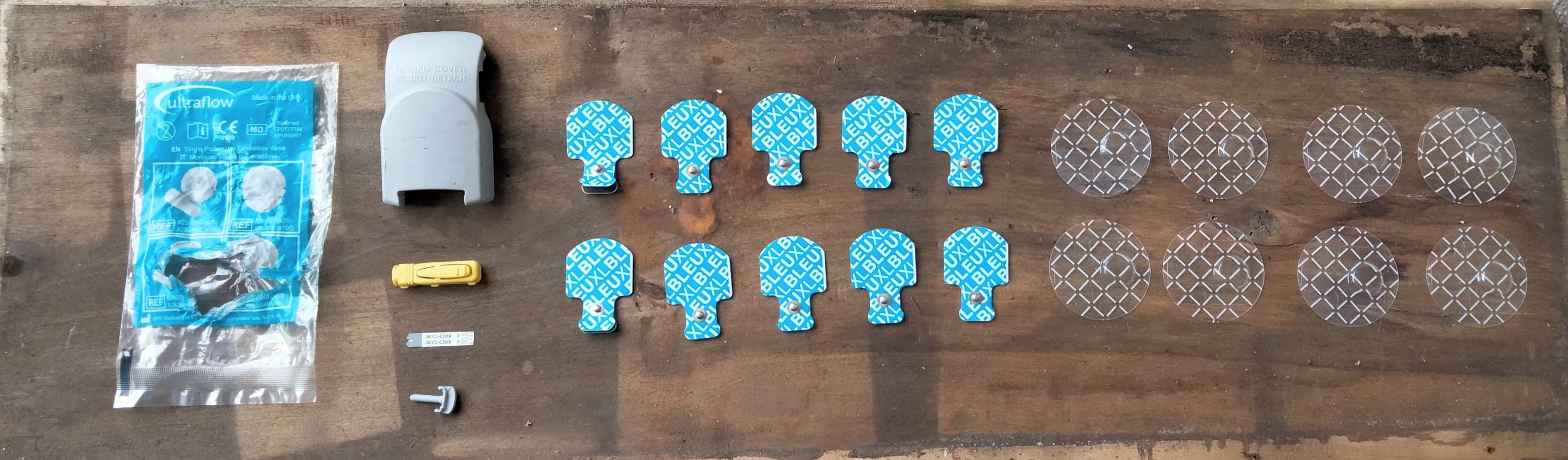
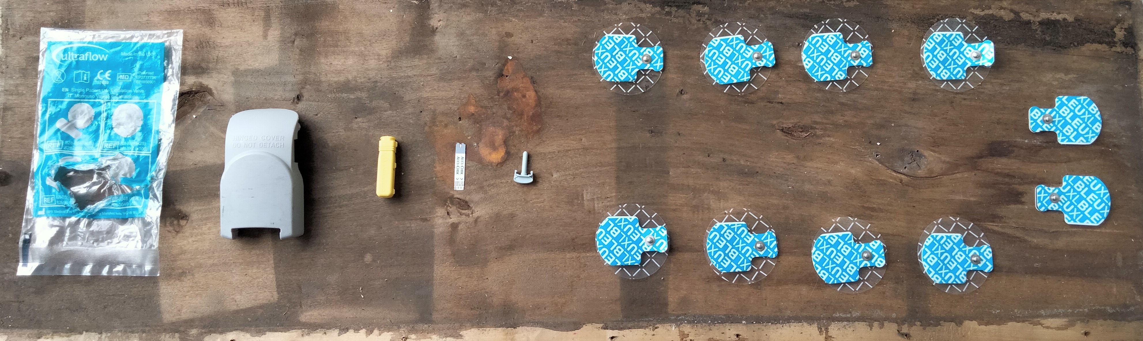
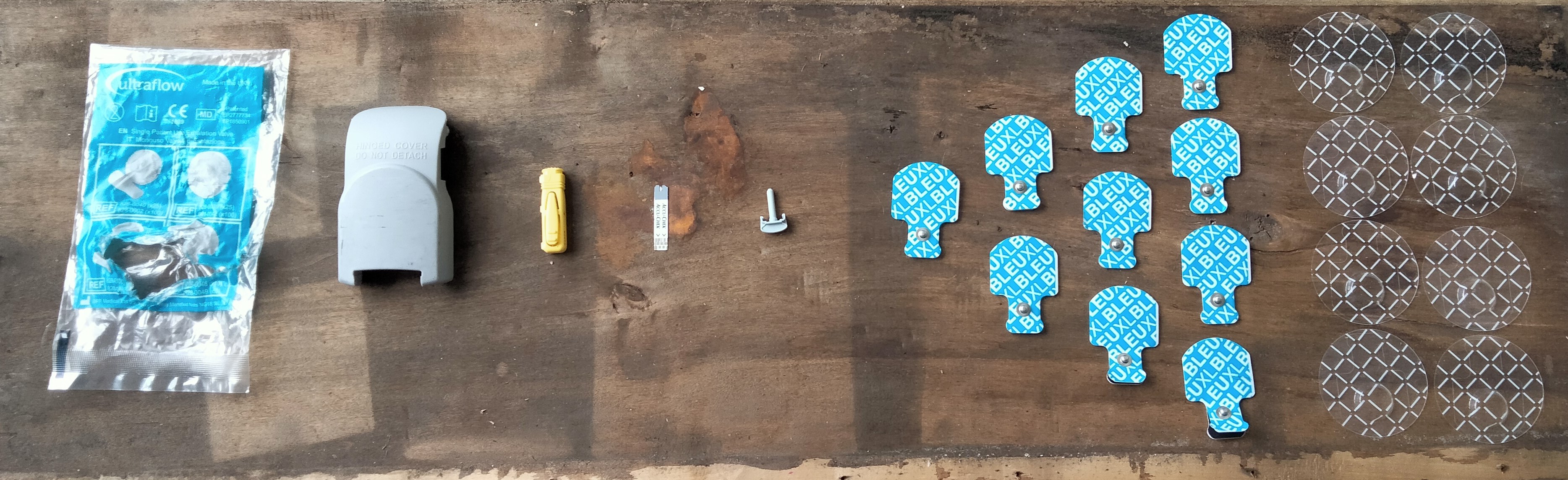
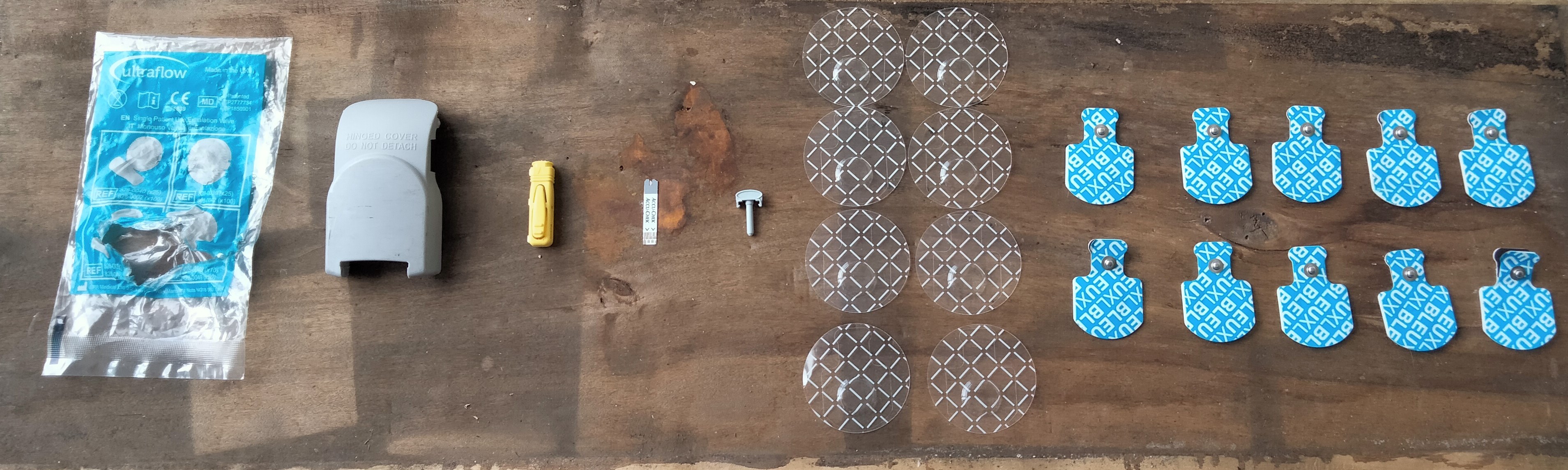
Today I have been using my Gelli Plate and my blister packs to create some prints.
I occasionally use my Gelli Plate rather than traditional printmaking techniques because the process uses acrylic paint and it dries very quickly. If you’re not sure what a Gelli Plate is there are lots of video tutorials on Youtube that you can access to see how it works and all the different ways you can create some cool effects. Or you can look at this blog on Handprinted: https://handprinted.co.uk/blogs/blog/gelli-plates-1
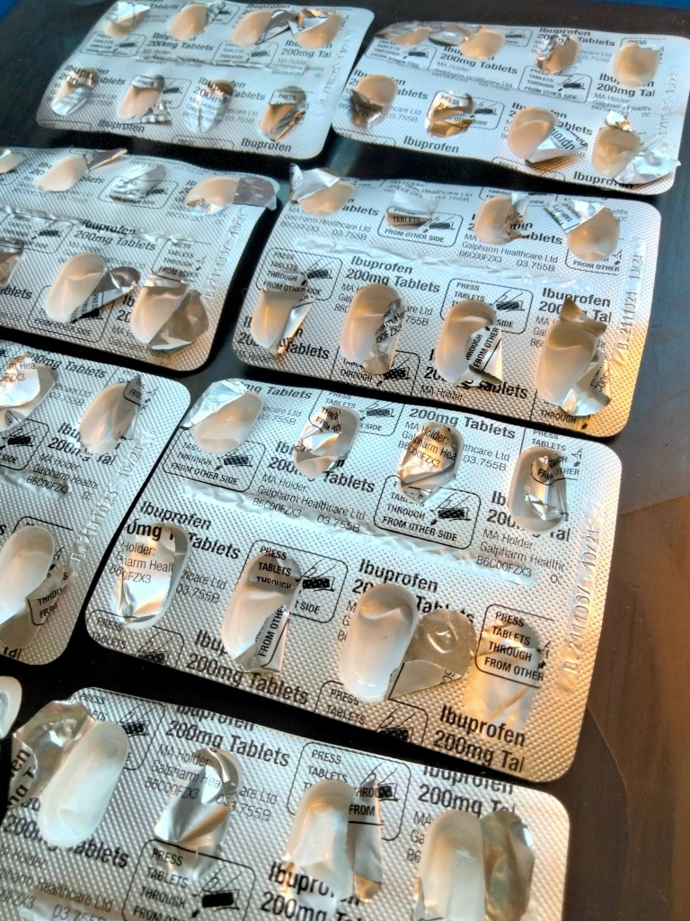

I have got all different sized blister packs from different my medications. They all have different shapes, sizes and arrangements in the layout of the blisters. I used a feew different methods to create images on the plate.

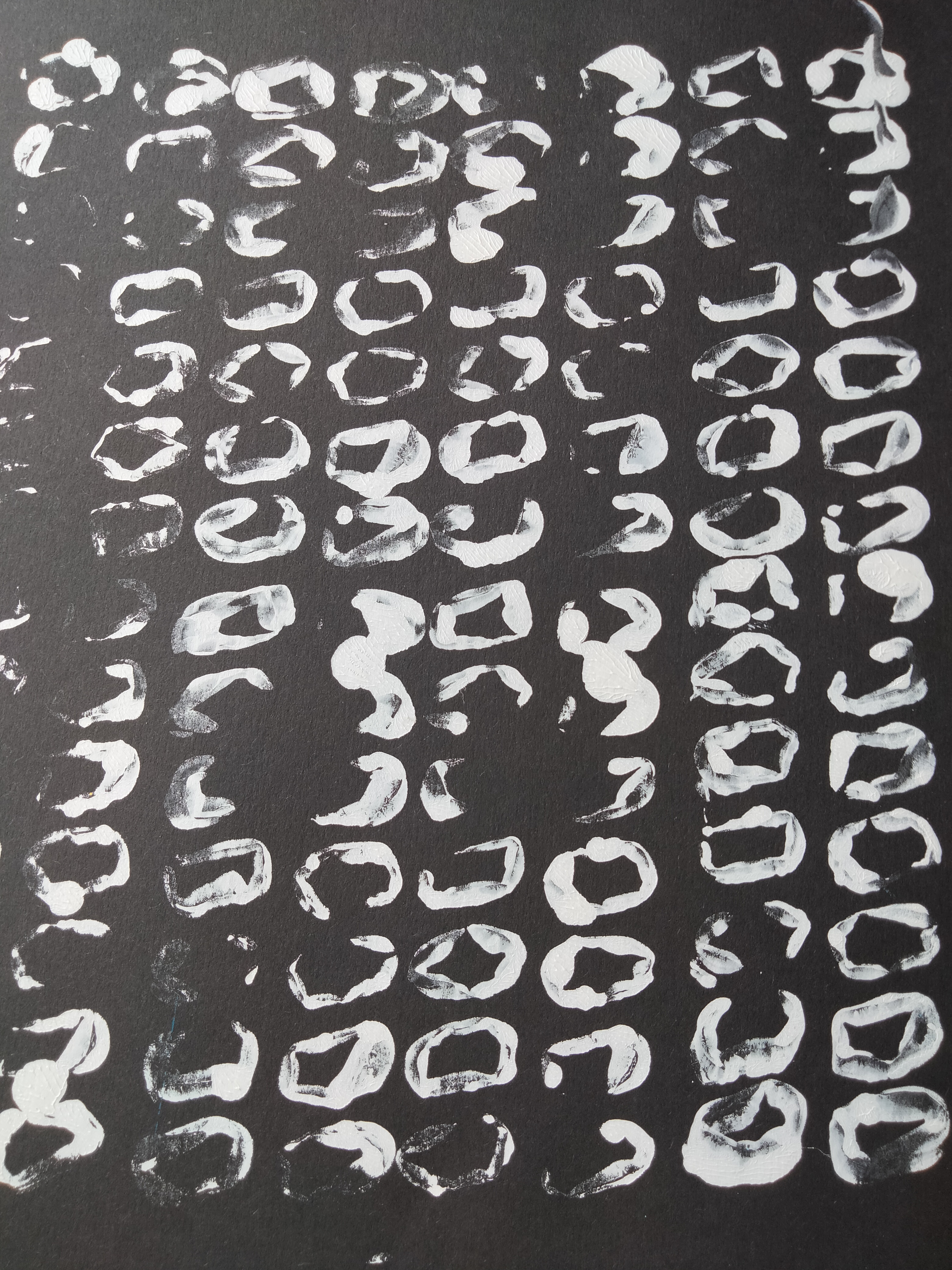
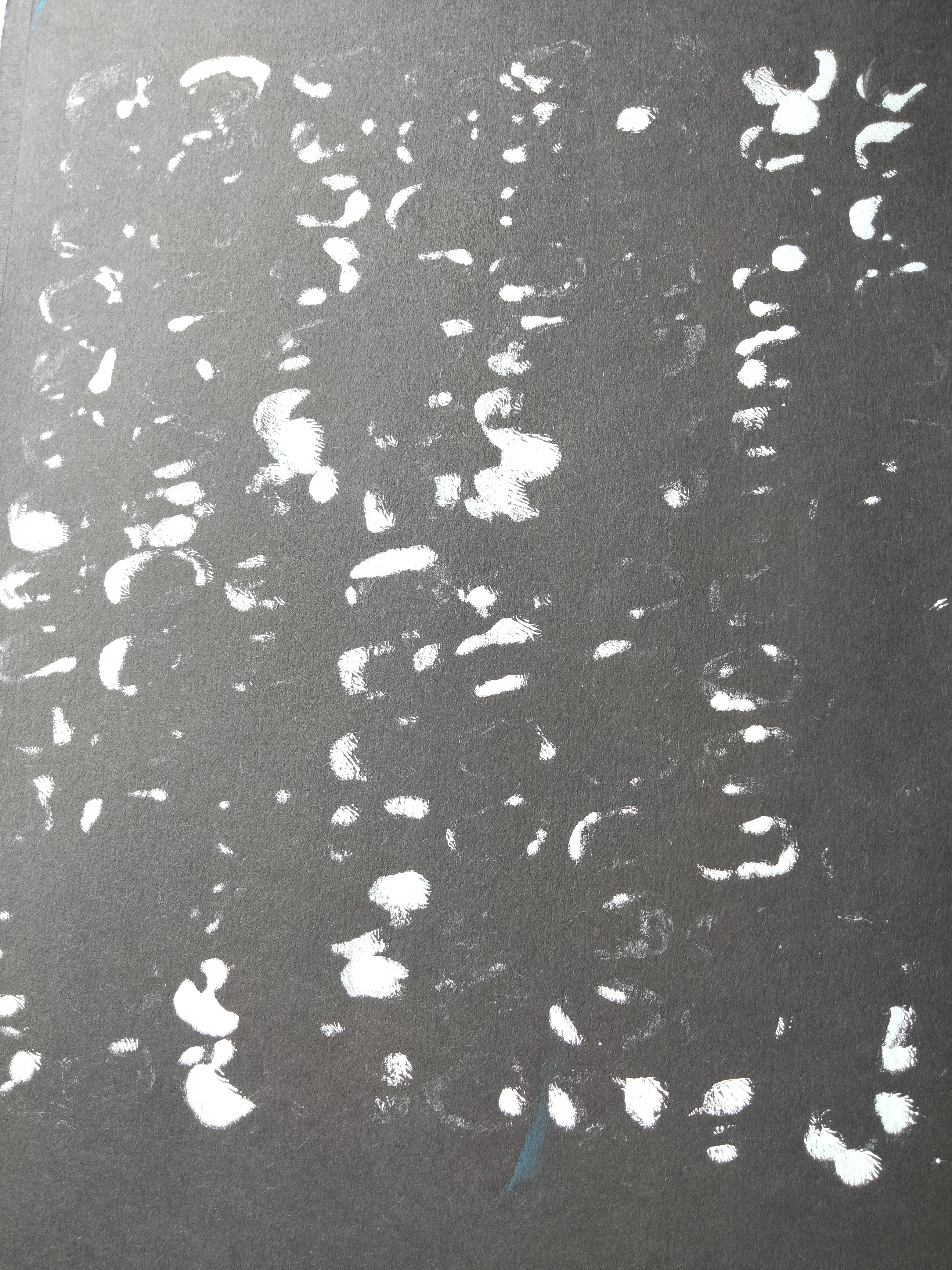
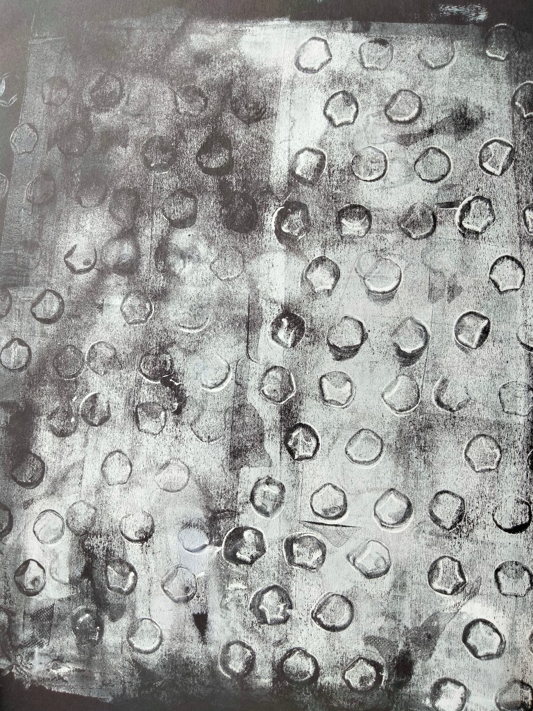
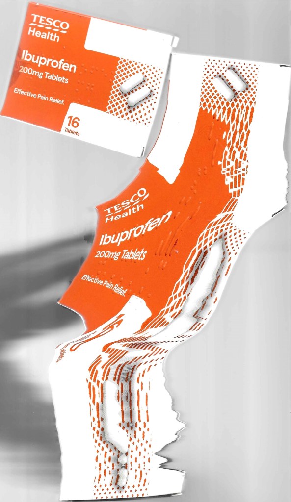
These are the first two prints. I used an ibuprofen packet. I painted the blisters white, pressed them into the Gelli Plate and then placed black paper over and pulled the prints. I really love the result. The marks are like tiny foot prints, or finger prints. It reminds me of some work I have done in the past using morse code. I took the second print because there was still paint left over on the plate.
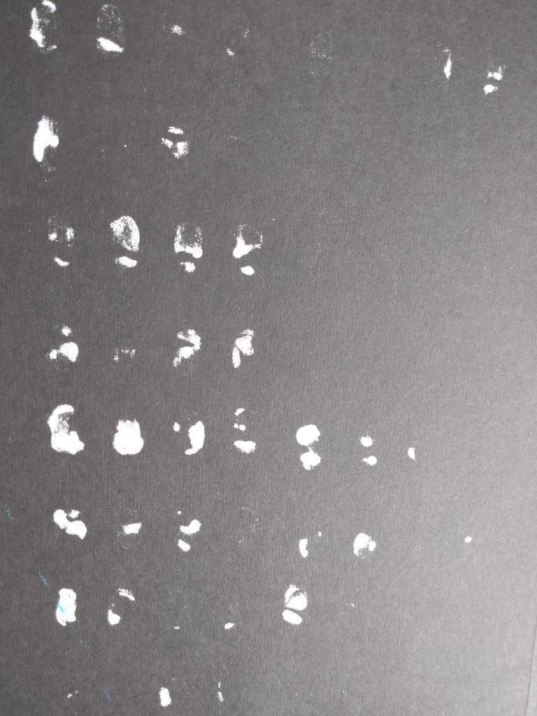

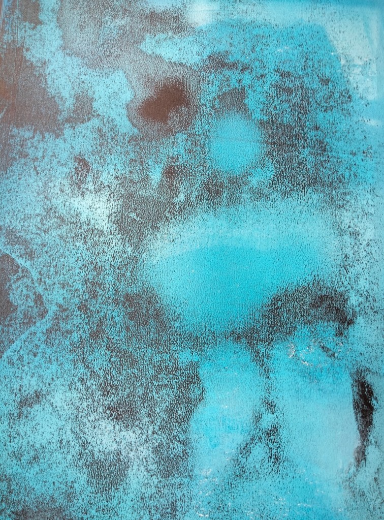
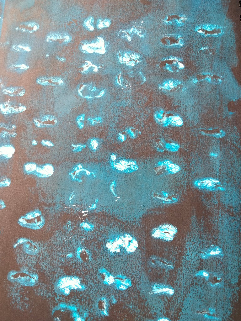
The Gelli Plate is quite a versatile method of printing and you can create prints with multiple layers of paint. After the second print there was still some excess paint left on the plate. I allowed this to completely dry and then overlayed the dry white paint with a layer of blue acrylic. I then pulled a new print. This print has actually managed to pull more of the original white markings off than the second print.
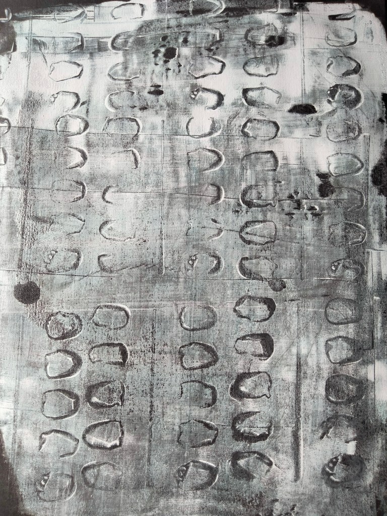
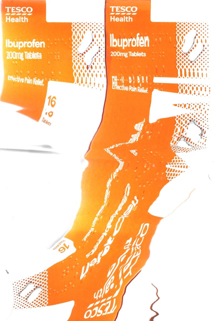
Below are three more prints using the exact same process as above but for these I used a Naproxen packet.

After those prints there was still some paint marks left! So of course I went in for another print! However very little detail of the blister packs came out but it is still a nice print.
Below are some more experimental prints which I did using other medication packages

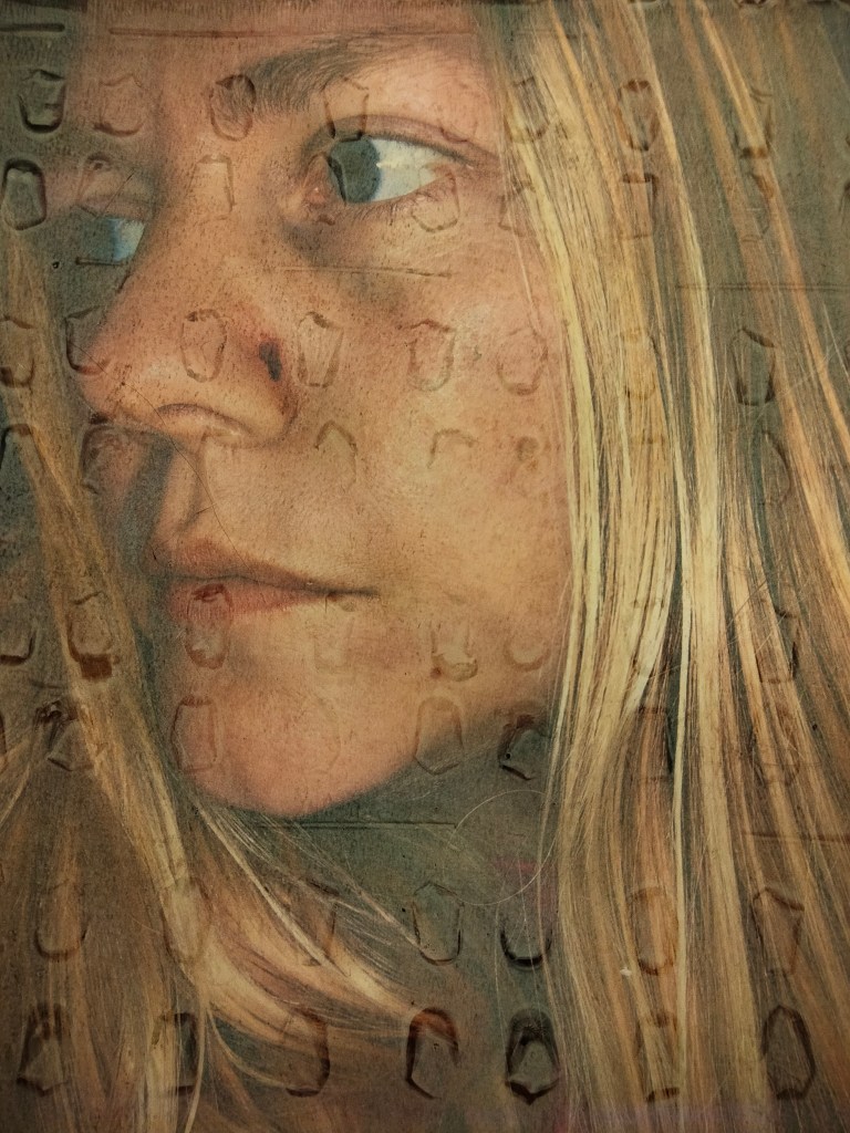
I wanted to add some context so have printed some photos of myself (unwell) onto regular printer paper and used the same Gelli Plate process to make some mixed media prints. The results are below.


I am going to continue doing lots more prints from the blister packs.
A few weeks ago (with a little help from my friends Daisy Fisher and Sam Meredith) I drew an outline of my body. I think am going to use the outline as a guide to create some large scale blister print pieces using the Gelli Plate.
This is my final post for my digital residency. I have really enjoyed sharing my work and my thoughts on the Jane Phillips Award blog. Thank you very very much to the Mission Galley for this opportunity. If anyone would like to get in touch with me personally you can contact me via Instagram @saskias.studio or @saskia.fletcher

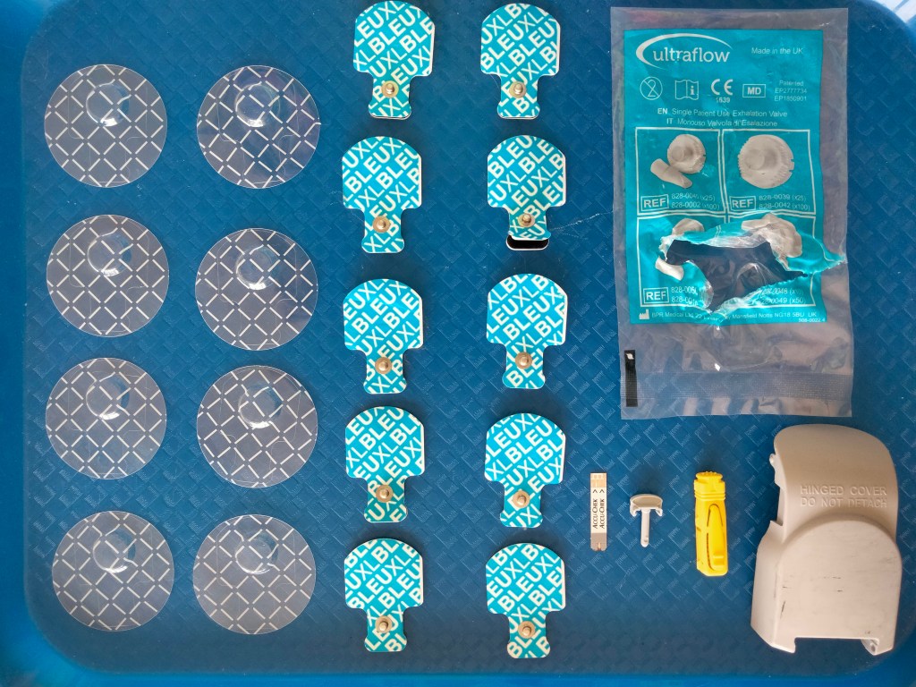
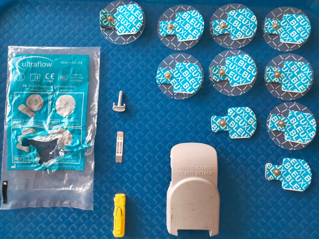
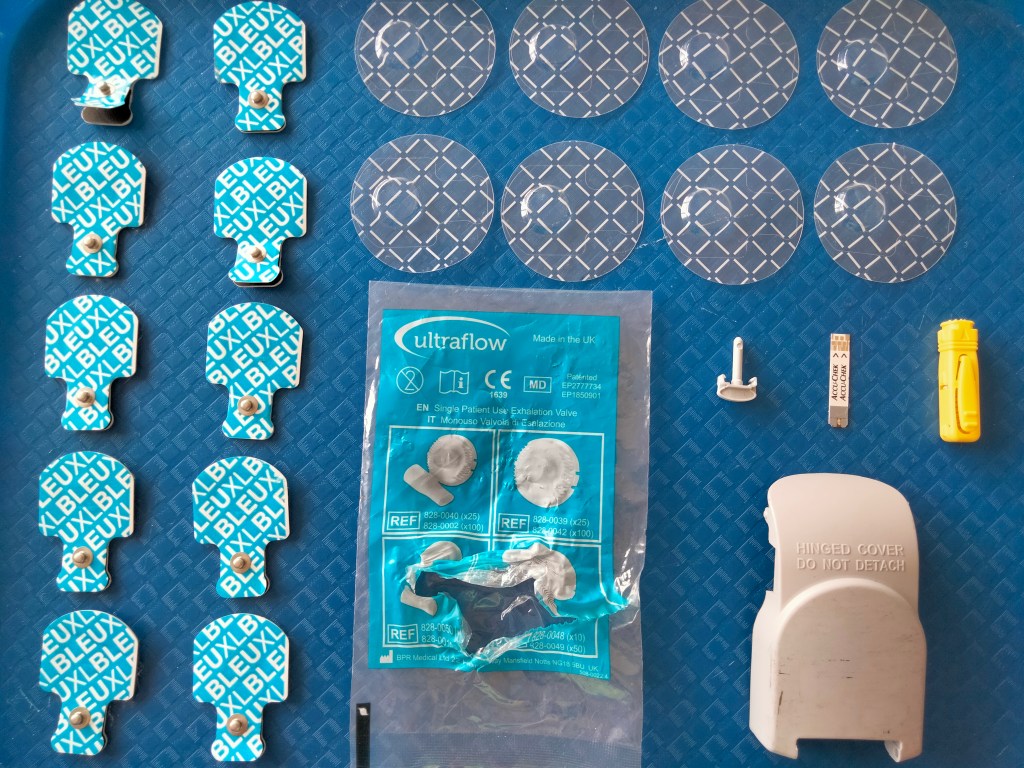
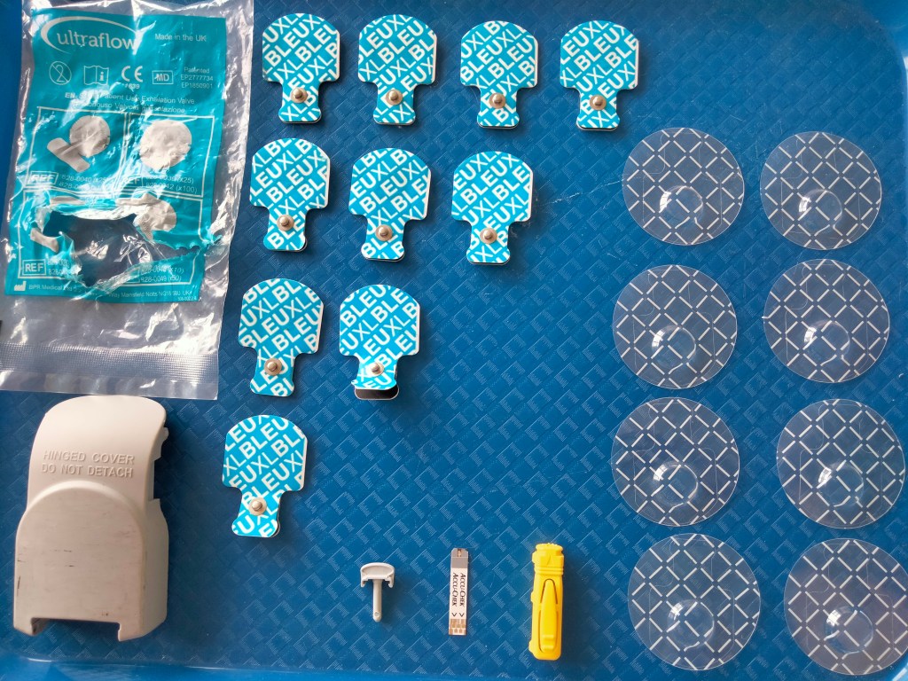
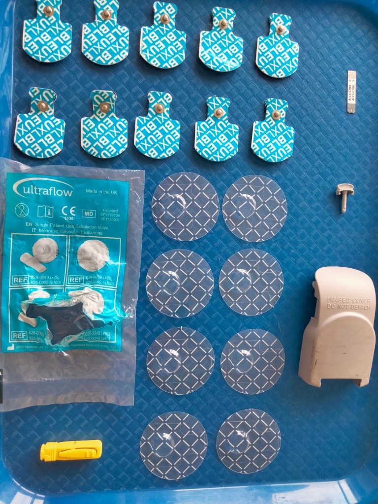
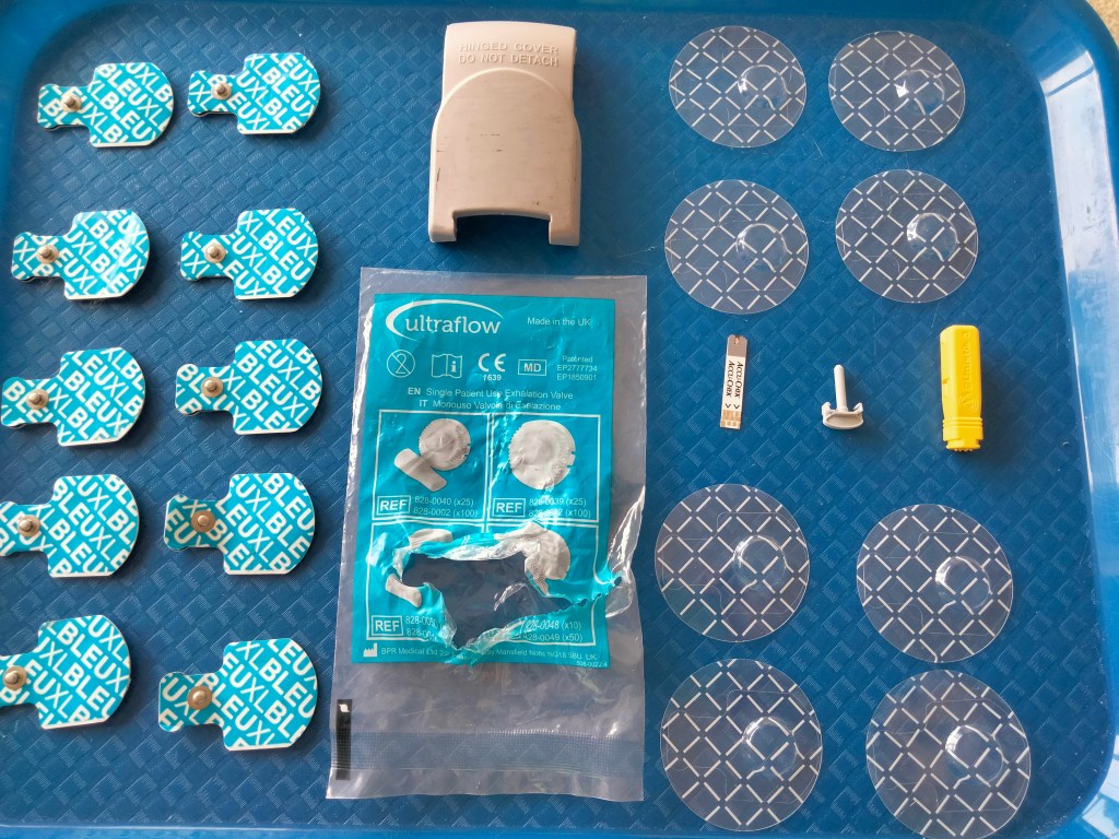
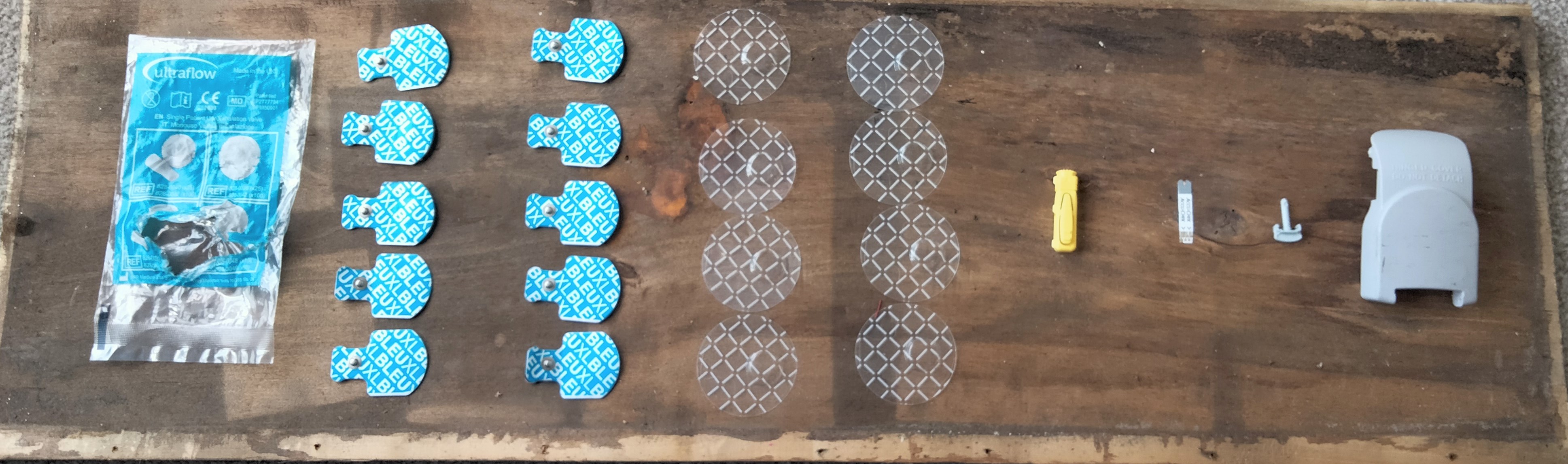
Something completely new for me… I have started work on an assemblage – Things The Paramedics Left Behind. Initially I thought that I wanted the items to be displayed on a while background however when I tried it out only the blue and yellow items stood out. It wasn’t as defined as I wanted it to be at all, particularly for the plastic items. Instead I have tried out different arrangements on a blue tray. Here are the test photos of the different compositions.
Things The Paramedics Left Behind – tray test photos
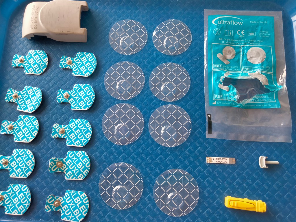
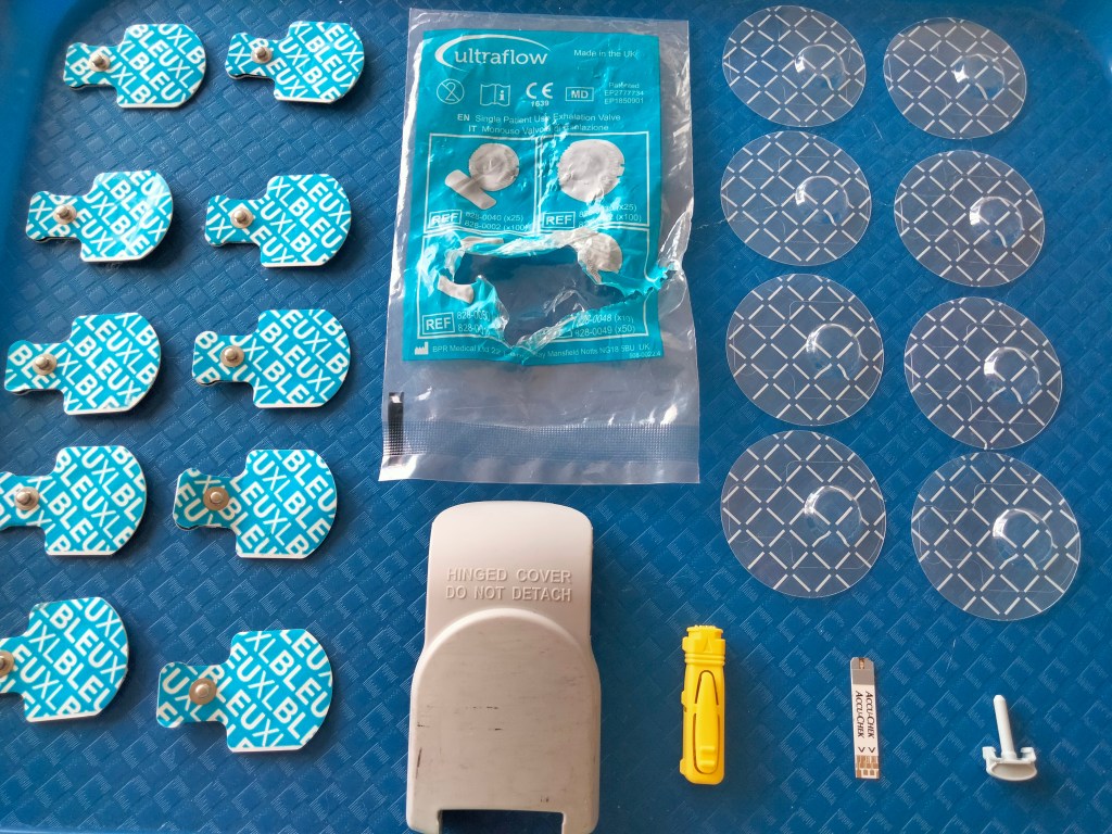
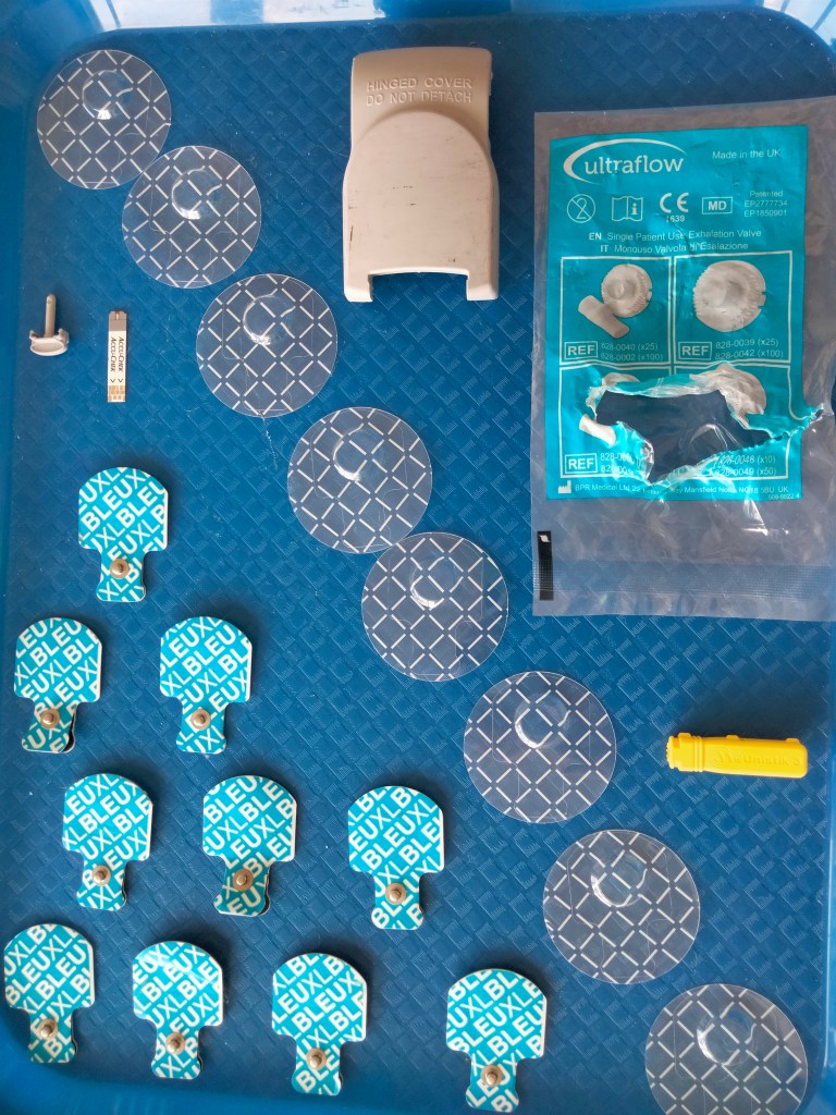
I have tried all sorts of different arrangements of the items. Overall I don’t feel as though the assemblage works well within the confined space of the tray. I think the shape of the tray really limits the options of where the objects can go. It feels restricted and the squashed. I also dont think it reads well. Therefore I have tried putting them items onto a piece of reclaimed wood.


Things The Paramedics Left Behind – reclaimed wood test photos
I think the arrangements on the reclaimed wood work much better because if the proportions of the space. It reads better as a group and also as individual items. I plan to attach the objects to the wood with small picture tacks.
As this is my first venture into trying to create an assemblage I would greatly appreciate any tips or opinions because I would like the work to be powerful and thought provoking.

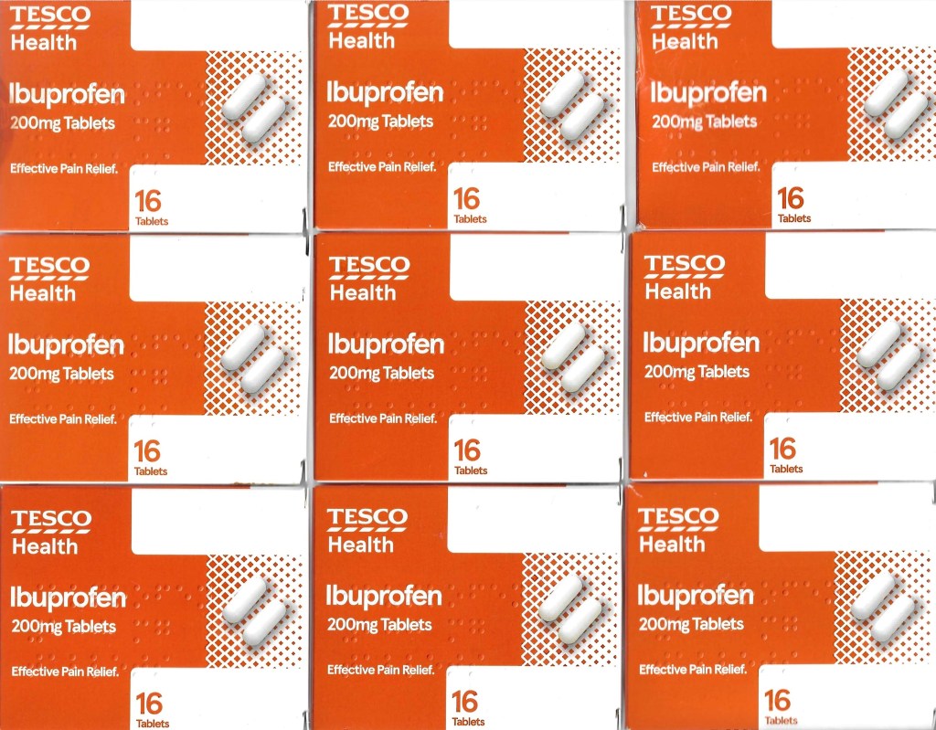
I have been collecting all the things surrounding my condition. The other day I absent mindedly stacked my Ibuprofen boxes together and really liked the aesthetic of the pattern and colour because it was so charateristic of Pop Art. So I decided to do a little further investigation and experimentation with them. I started by using the scanner laying them out to create a repeated pattern. I then took this further and started to manipulate the shape and form of the packaging in many different ways.


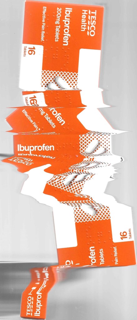
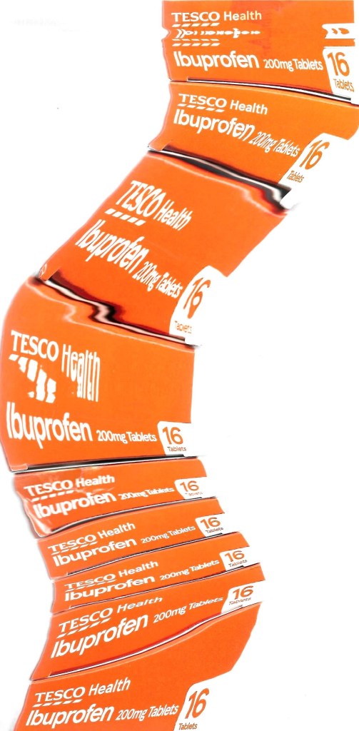
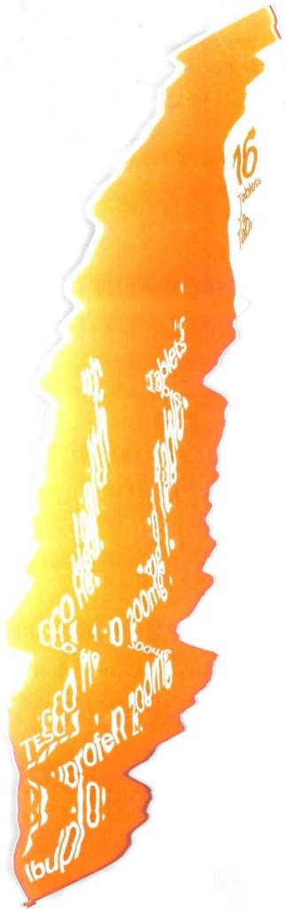


I’m not sure yet if I am going to do any further processing with the boxes but I enjoyed developing a simple idea into a future possibility. Next I am going to start exploring all the different types of blister packaging.

I have started quite a self indulgent project in recent weeks. I am documenting my own health. As a starting point I have starting collecting- objects, photographs, videos and my thoughts through creative writing.
I think this new body of work is going to be quite a departure from my work in the past because I am focusing on myself, but strangely I don’t feel self conscious about it. I think it’s because I am experiencing alot of unusual things, quite different from the life I used to have before I started experiencing health issues. Therefore it feels important to be recording it, reacting to it and responding in a creative way.
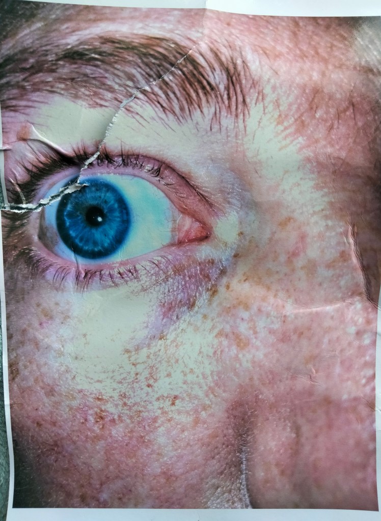
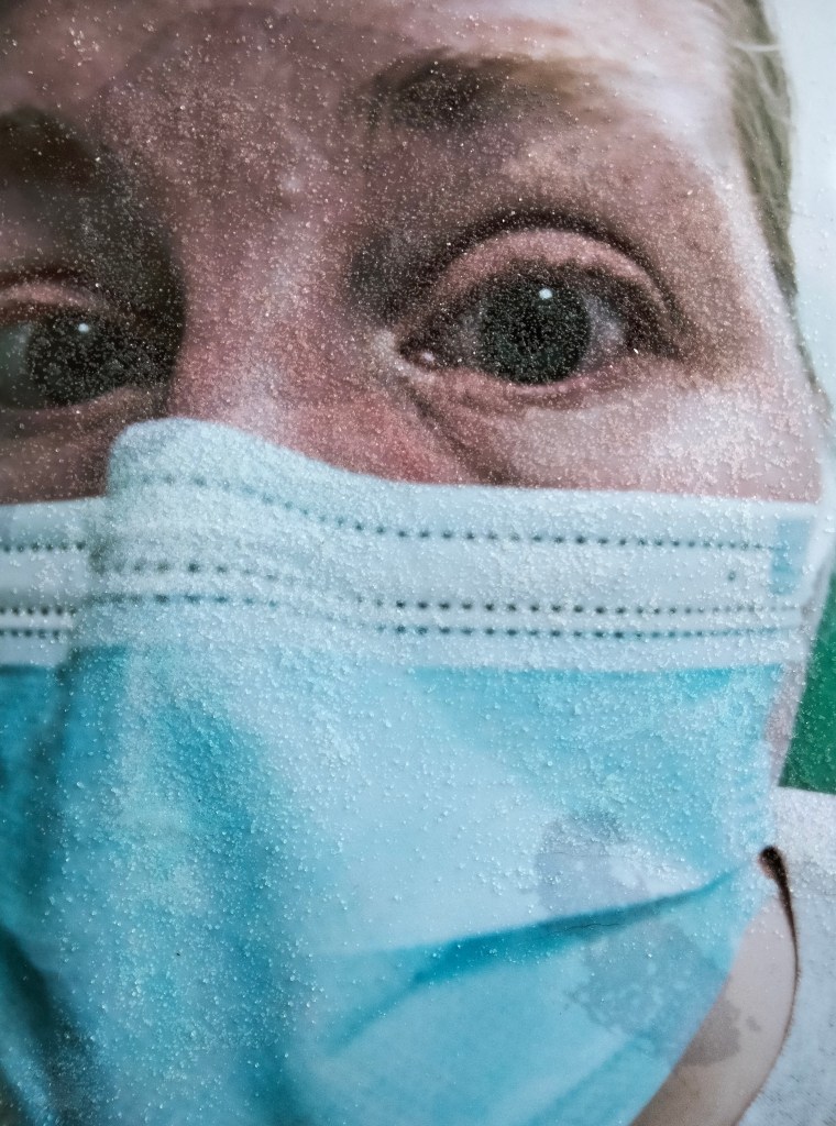
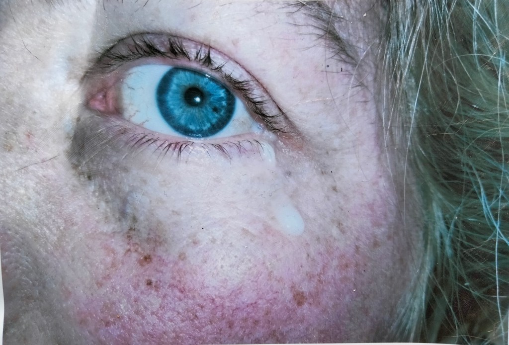
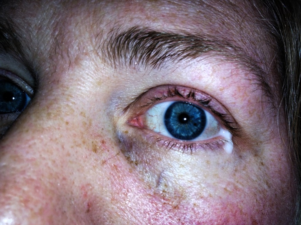
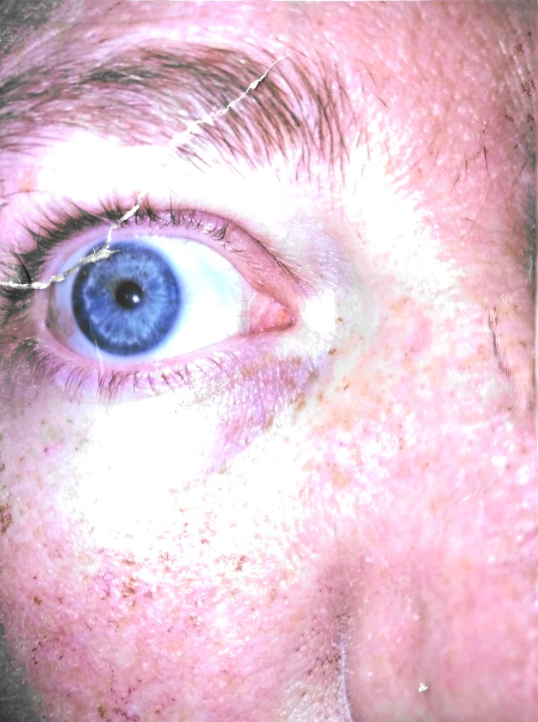
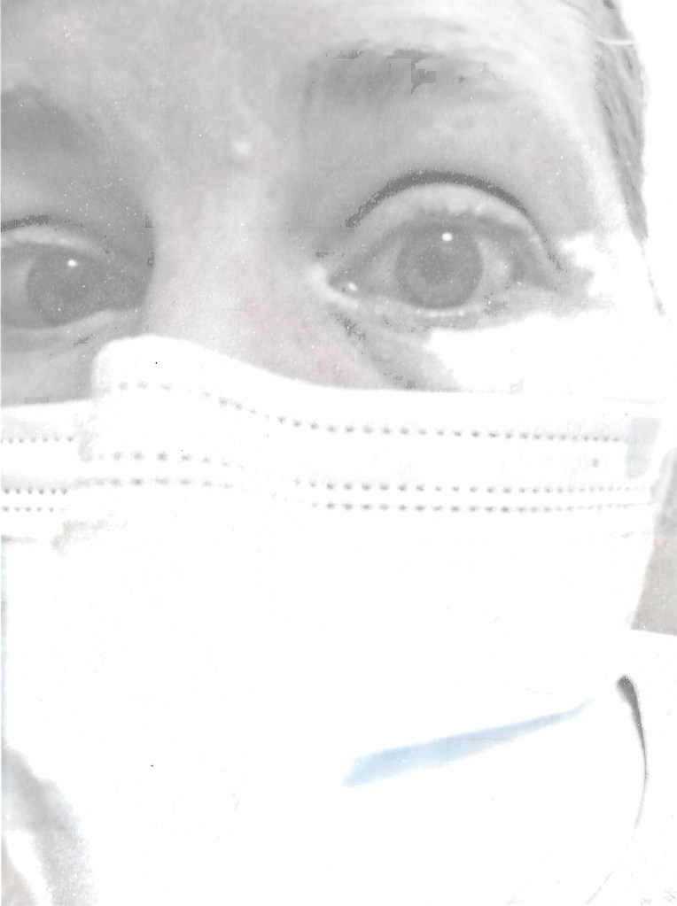
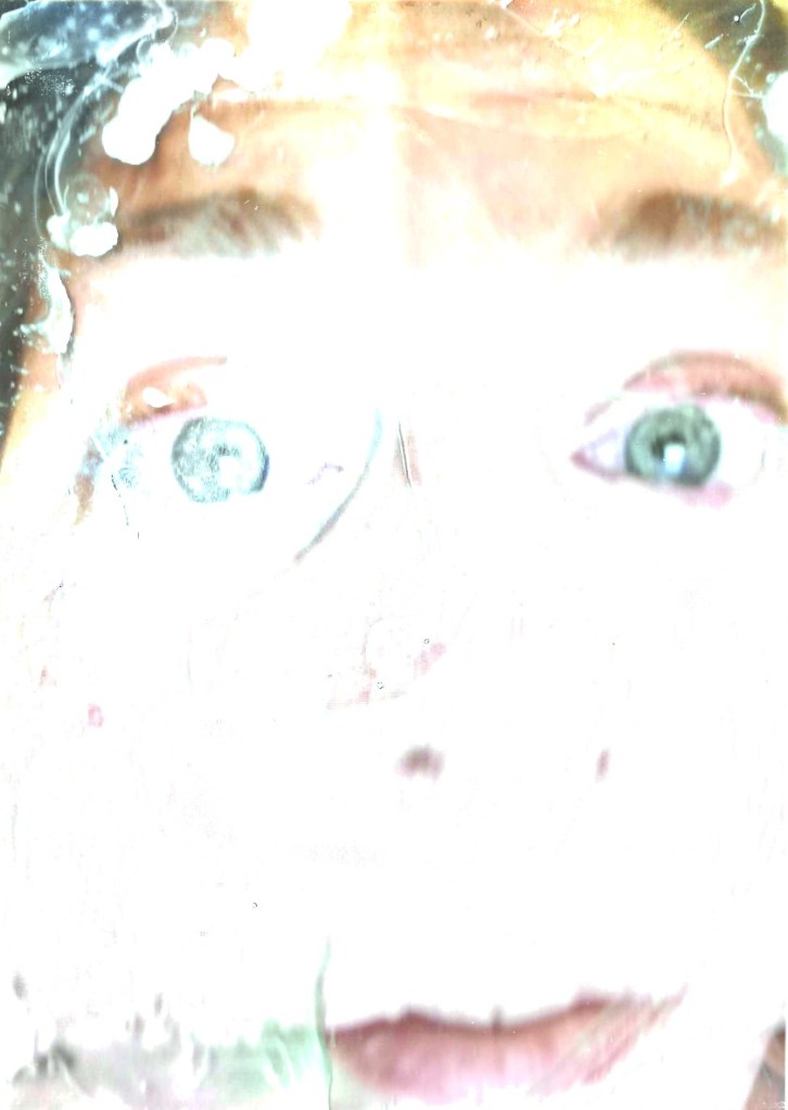
At the time that the below photos were taken I was unable to see anything due to eye inflammation. I am quite impressed that I even managed to capture myself in the frame!


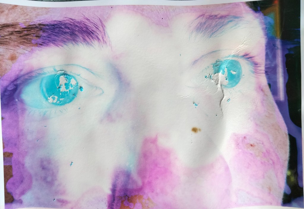
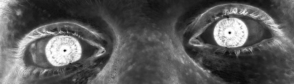
I still consider myself a novice in Photoshop techniques but I quite enjoy the process of digital photo manipulation so I have had a go to see what results I could achieve. My aim was to try and highlight the white eye drops against the the rest of the face by changing them to black and white and then inverting them to make it look like black dripping out of the eyes. It didn’t really work, the drops just ended up grey. However, I enjoyed the process and although I didn’t achieve what I wanted, some of the results are quite cool and detailed.


I have printed the photos so that I can also physically manipulate them. I want to blur out the images and I am going to try several different processes to see what effects I can achieve. I want to create a blurry veil to mimic my blurred sight.
I’m quite disappointed with the minimal effects that my processing has had on the photos. I was expecting some much more dramatic results. I think it is because I ordered very high quality photo paper.
Boiled – didn’t really do anything other than break down the strength of the back of the paper
Harpic toilet cleaner – I like this effect. At first I wasn’t keen on the blue colour, but now I quite like it because it fits in with the medical theme.
Margarine – hasn’t changed the image at all
Oil and salt – I added the salt afterwards because the oil didn’t really do anything
Plaster- I like this outcome but need to somehow seal it on the photo so that it doesn’t break off of the surface
Hand soap – only a slight darkening to parts of the image
Vasaline – has done nothing to the surface of the image. I thought this method would be much more effective than it has been
Wax – tricky to pour it where I wanted it to go – perhaps dipping the photo into the wax might work better
Bleach – had to be bleached twice because the first bleaching didn’t really do anything at all. I quite like it now that it has been bleached twice
I put my manipulated images into my scanner and some strange things happened to some of them. They scanned in as normal and then when saving they went through an ‘enhancing’ process on the app and the colours washed out. Quite interesting… and I can only assume it is because the scanner uses light to capture the images.


When I couldn’t see I felt quite vulnerable and somewhat lonely. These were very new feelings for me to experience! I struggled alot with these emotions and it was the worst part of not being able to see. I am going to try and explore these emotions some more and try and get them to reflect in my work.

 This is the opening shot to the episode, setting the location and mystery the episode will follow.

*All p/in/p videos fade in and out*
Half profile shots of the two leads of the episode (a police investigator and the leader/ sub-boss of the biker gang suspected of the murder. Beside each are small videos showing actions of the upcoming episode to give a brief insight to the characters.)

Main title card for the episode, pic 1 is independent, while 2 and 3 are together.
I have a new project to complete for my university course, called ‘Winter is Coming.’
The aim of this project is to create an opening title for a fictional anthology series called ‘Winter is Coming,’ with each of us creating a basic outline for an episode and constructing the opening title sequence around that.
Below you will find some preliminary notes I made about the project.
Winter is Coming opening credits
Episode style/story notes-
Opening credits content notes-